
In today’s digital age, it has become increasingly common for consumers to research and evaluate products and services online before making a purchase. Many people visit a shop’s website before deciding to visit in person and their experience with the site could influence that decision dramatically.
Suppose you want to order a drink from Shake Smart. You check out their website, but it’s overwhelming as there’s too much information presented. You check their menu, but you don’t see any pictures of what each drink looks like. You don’t see the price of each item either. While seemingly minor, these negative encounters can accumulate and significantly impact the overall user experience, potentially driving away potential customers.
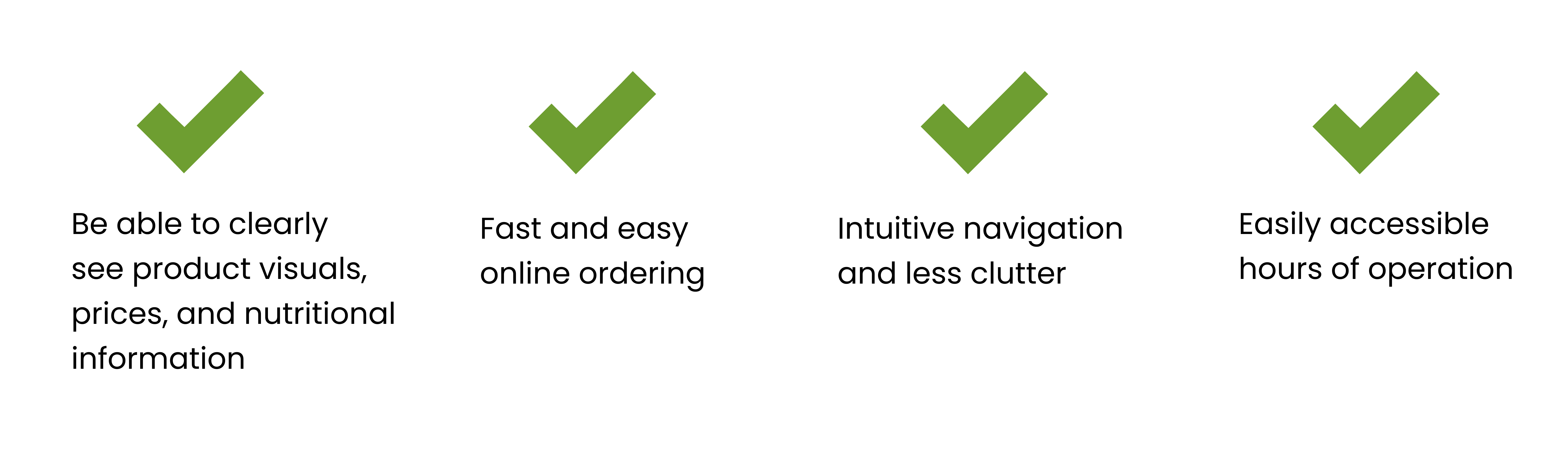
We interviewed people who are at the store and in close proximity to Shake Smart and were able to gather 15 responses. We found that half of the customers don't even use the website, while the other half is frustrated by the current website. To get a better understanding of how we could improve the existing website, we asked the non-users to give their first impression and had them complete a series of tasks that requires navigating through the site.
Based on what we gathered, the customers want:
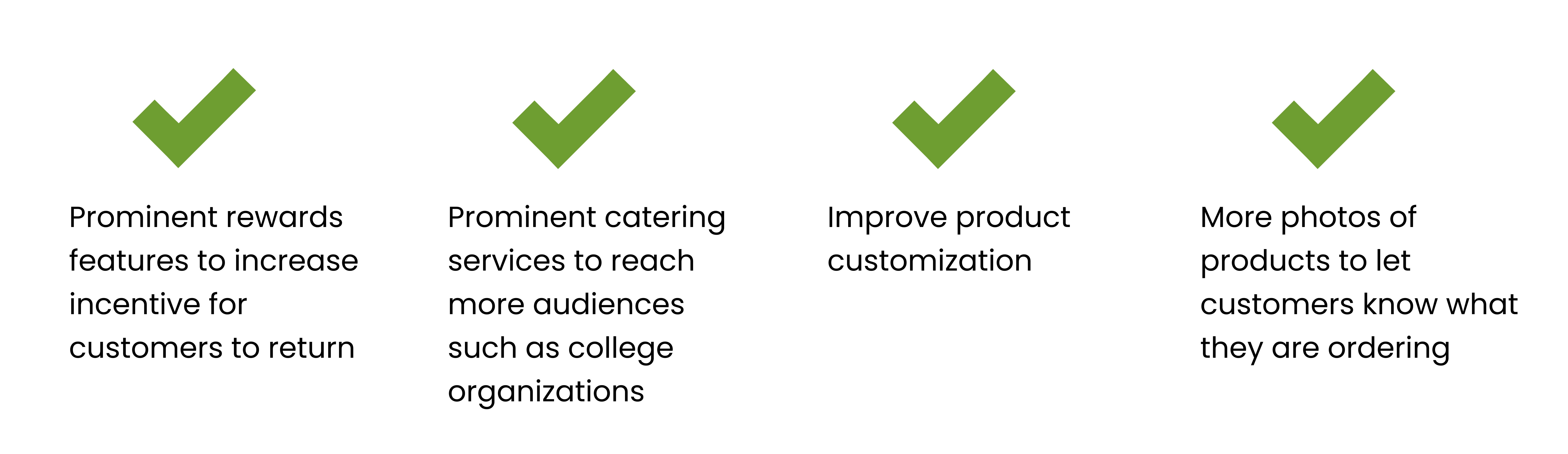
We had to meet with our client in order to get a better understanding of their needs and discuss each step of our process in redesigning the Shake Smart website. Based on our first interview session with the Shake Smart manager, we were able to pinpoint the client's objectives:
We analyzed the branding, features, functions, content, and site architecture of Everbowl, Jamba Juice, Blue Bowl, Joe & the Juice, and Plant Power.

We chose these websites due to their popularity within the same target market, as they present themselves as healthy juice/smoothie and food shops. They are also in close proximity to one another, drawing in a consistent customer base within the same area.
Jamba Juice
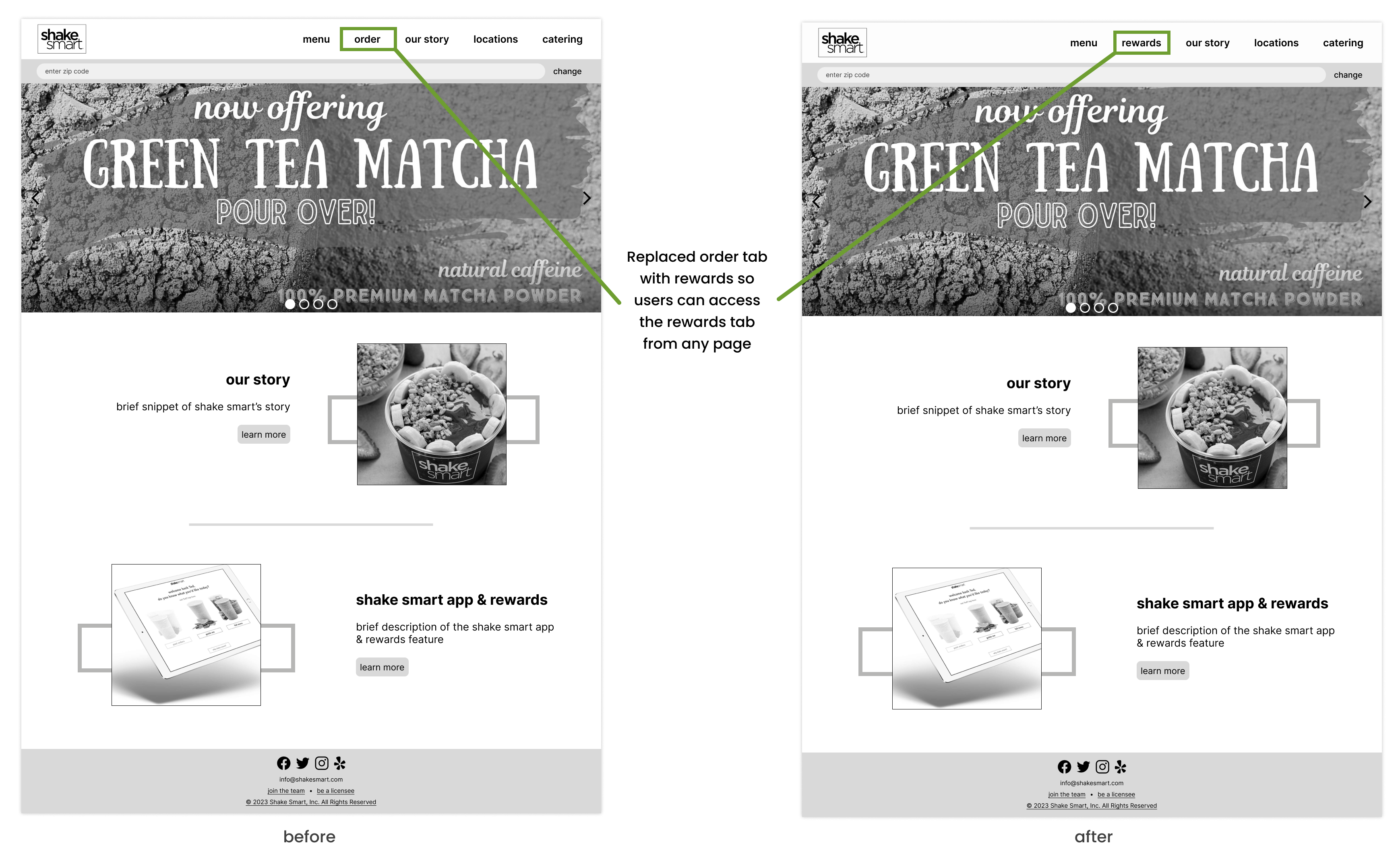
Static order button: No matter which page/tab a user is on, they always have access to the order function which is what most people who come to the sight want to use.
Blue Bowl
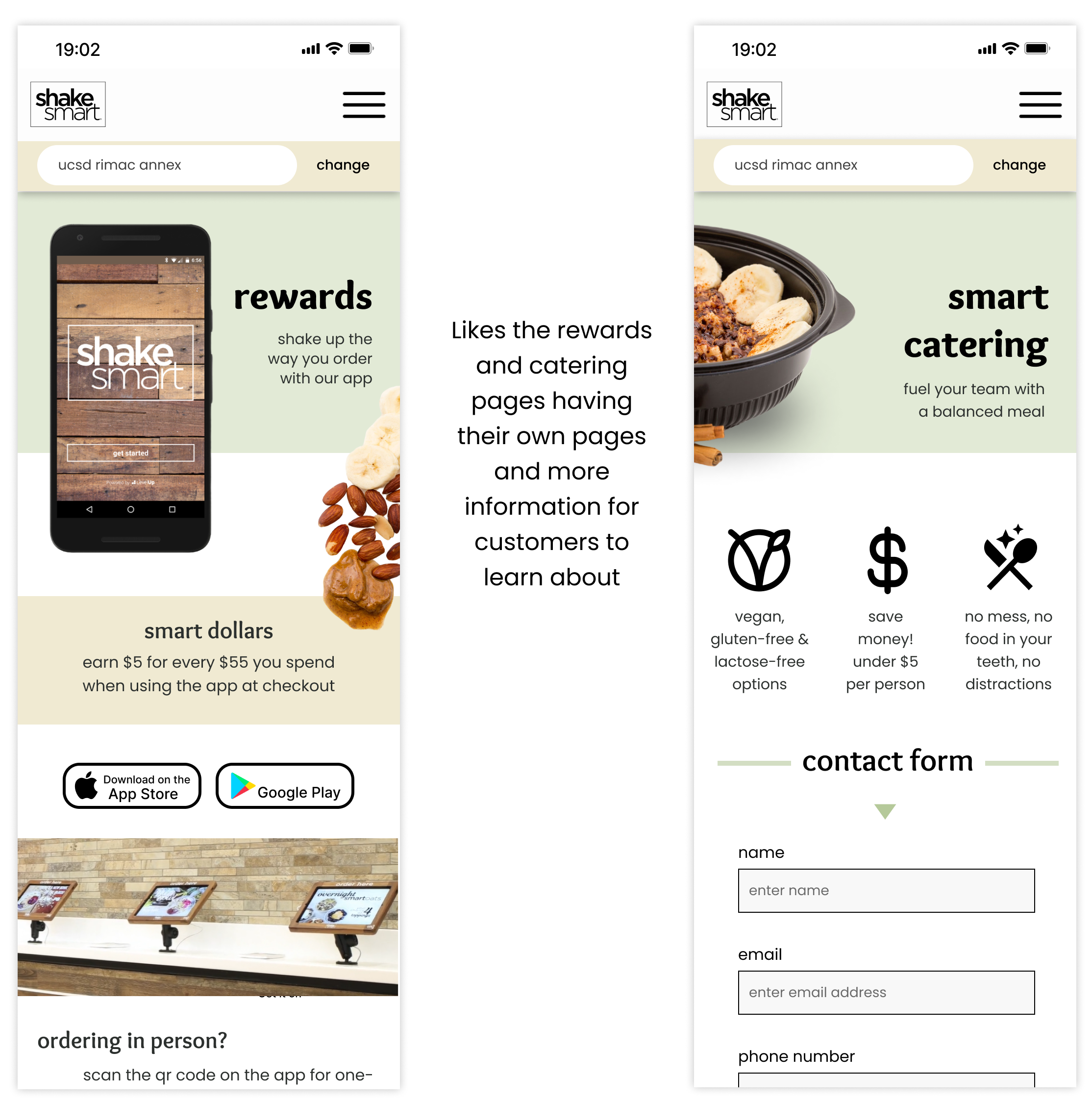
Discoverable catering: Blue Bowl also has a very informative catering tab with information on how to contact them based on number of people. Catering can be an important part of business, so making sure that it’s easy to find like it is on Blue Bowl’s website is important.
Plant Power
Footer Navigation: Including navigation tabs that are less important on the footer is smart because it’s out of the way of everything else and users always know to find it on the bottom of every page.
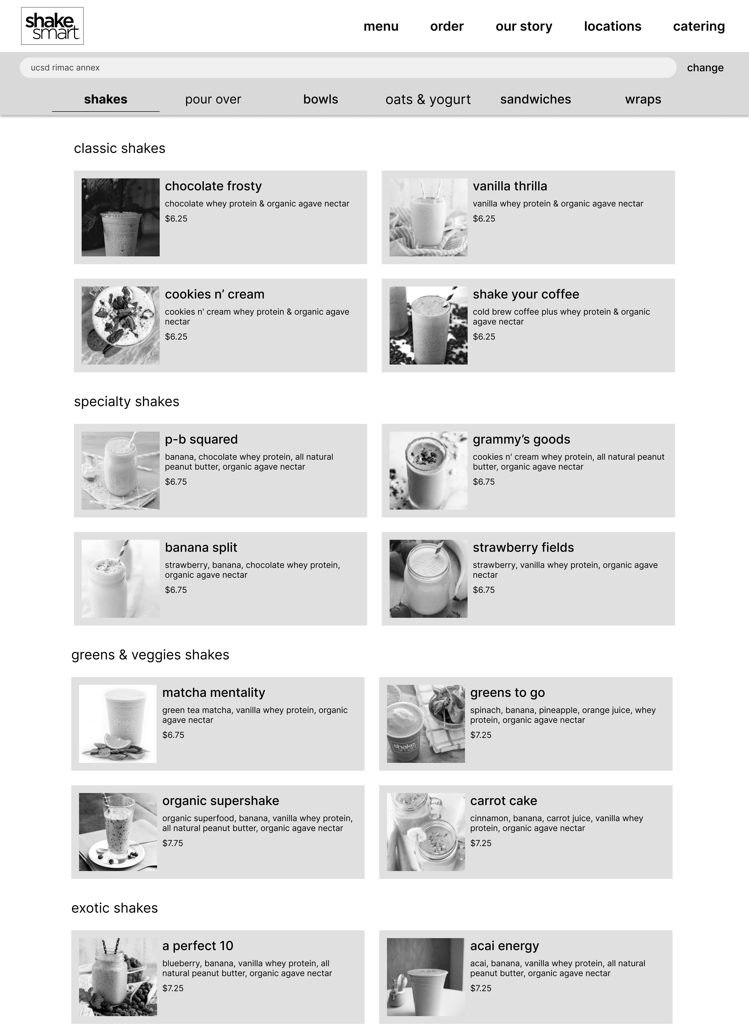
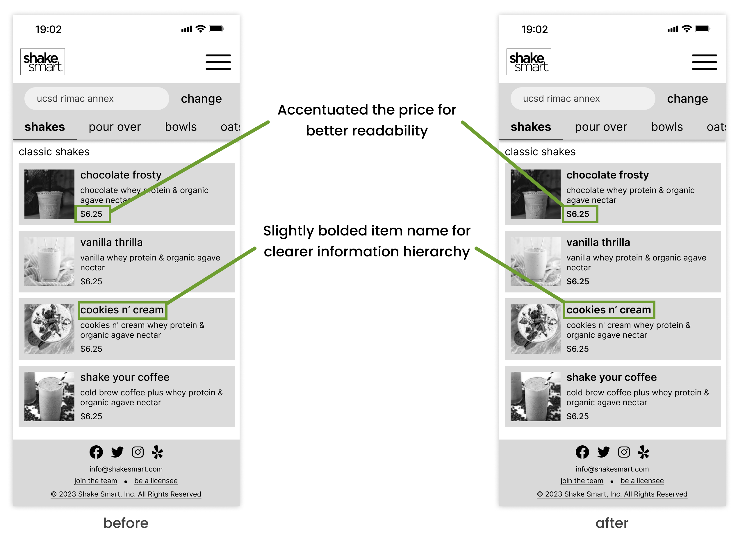
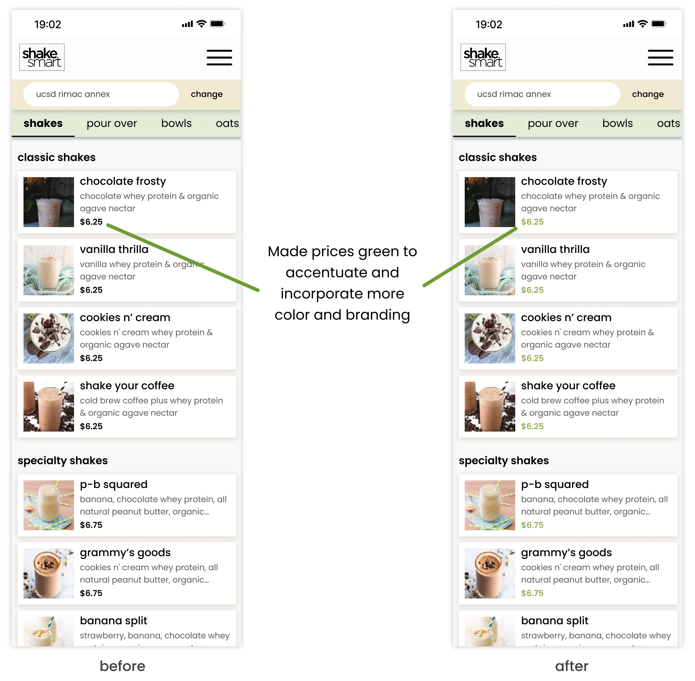
Prices Directly on the Menu: Straight from the menu, users are able to see the prices of the items, making the process finding what they want easier since they don’t have to go looking for the price.
Once we understood our users and client, my team and I moved onto wireframing where we decided on the site architecture and functionality.
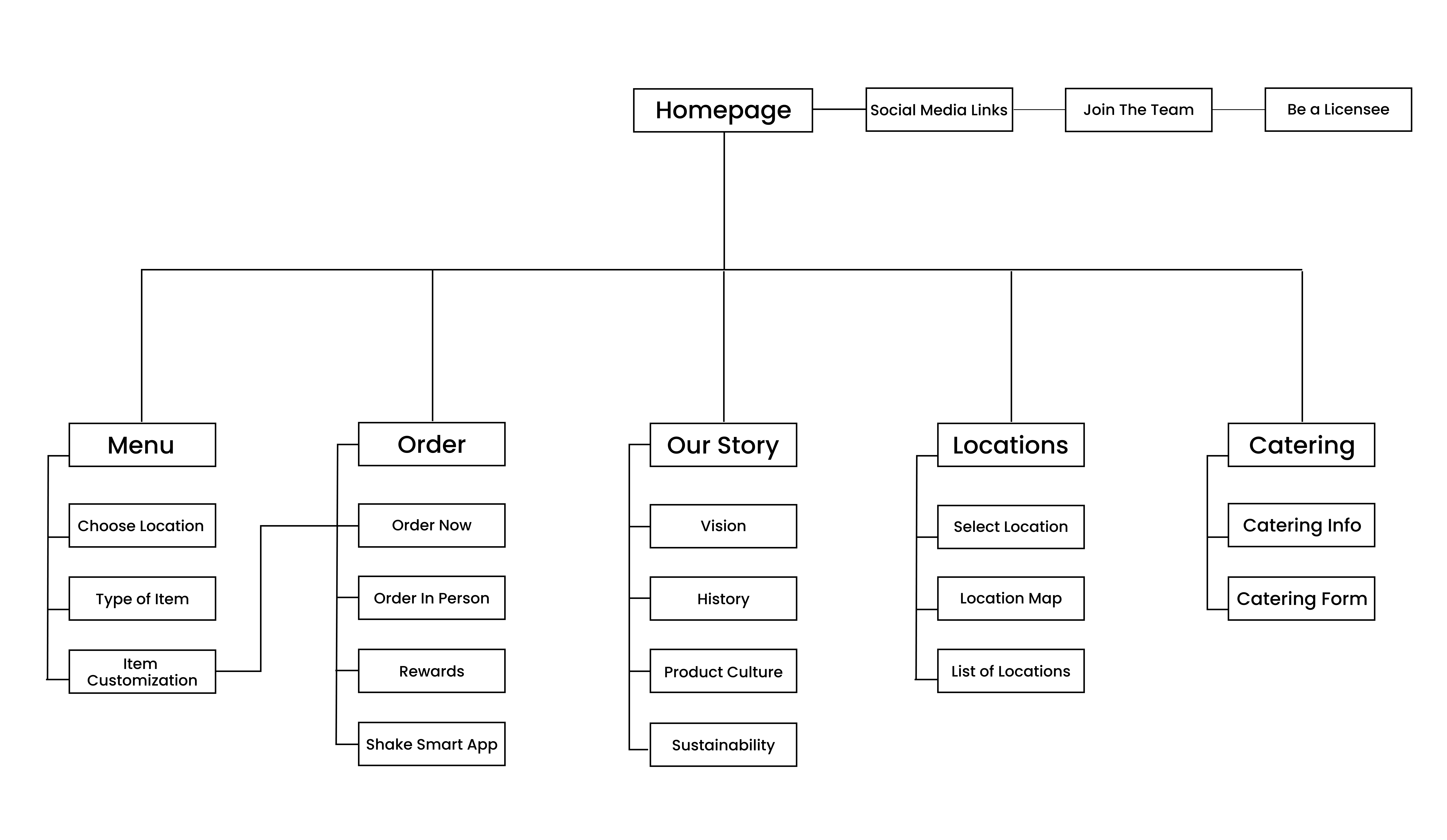
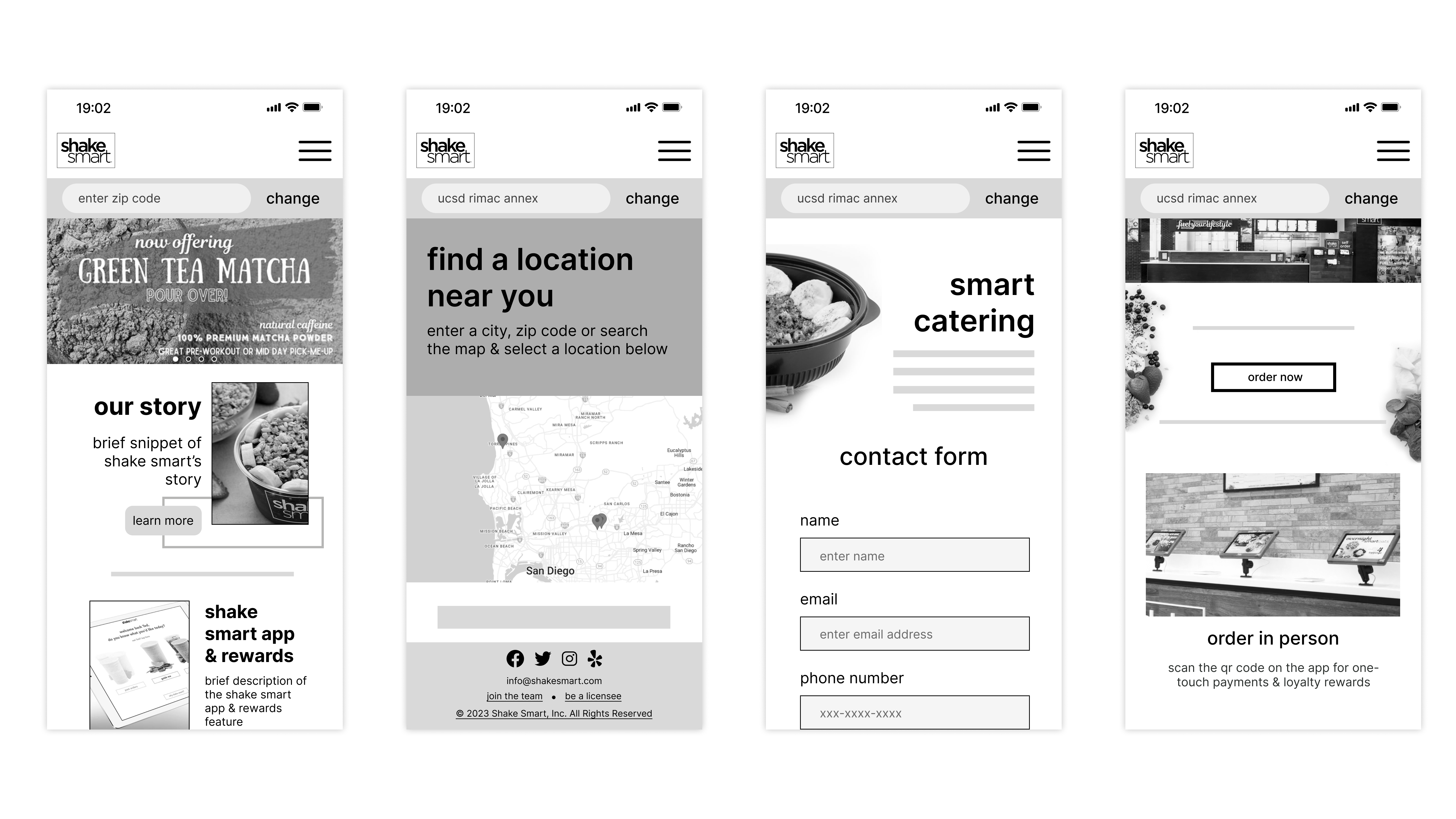
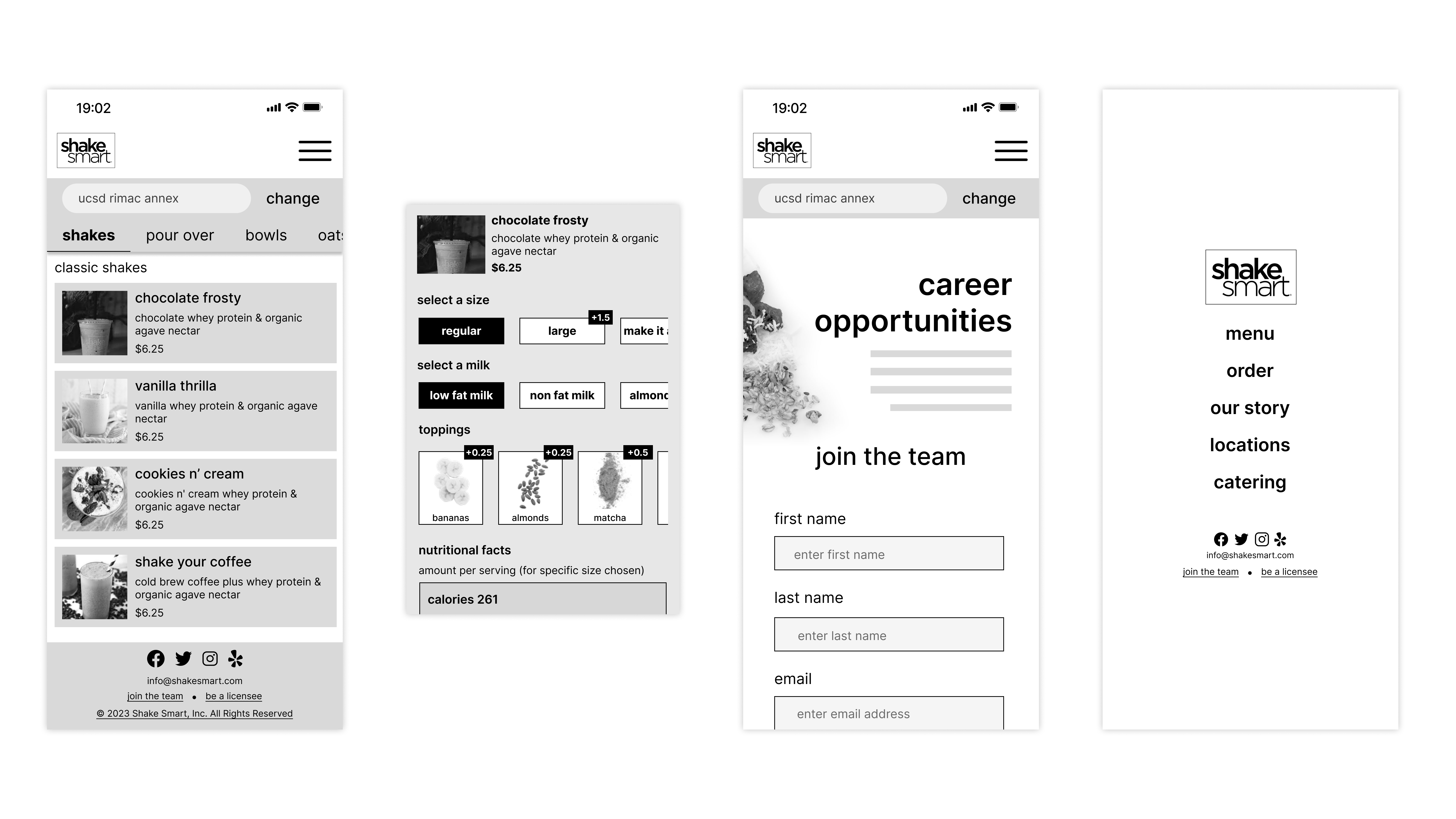
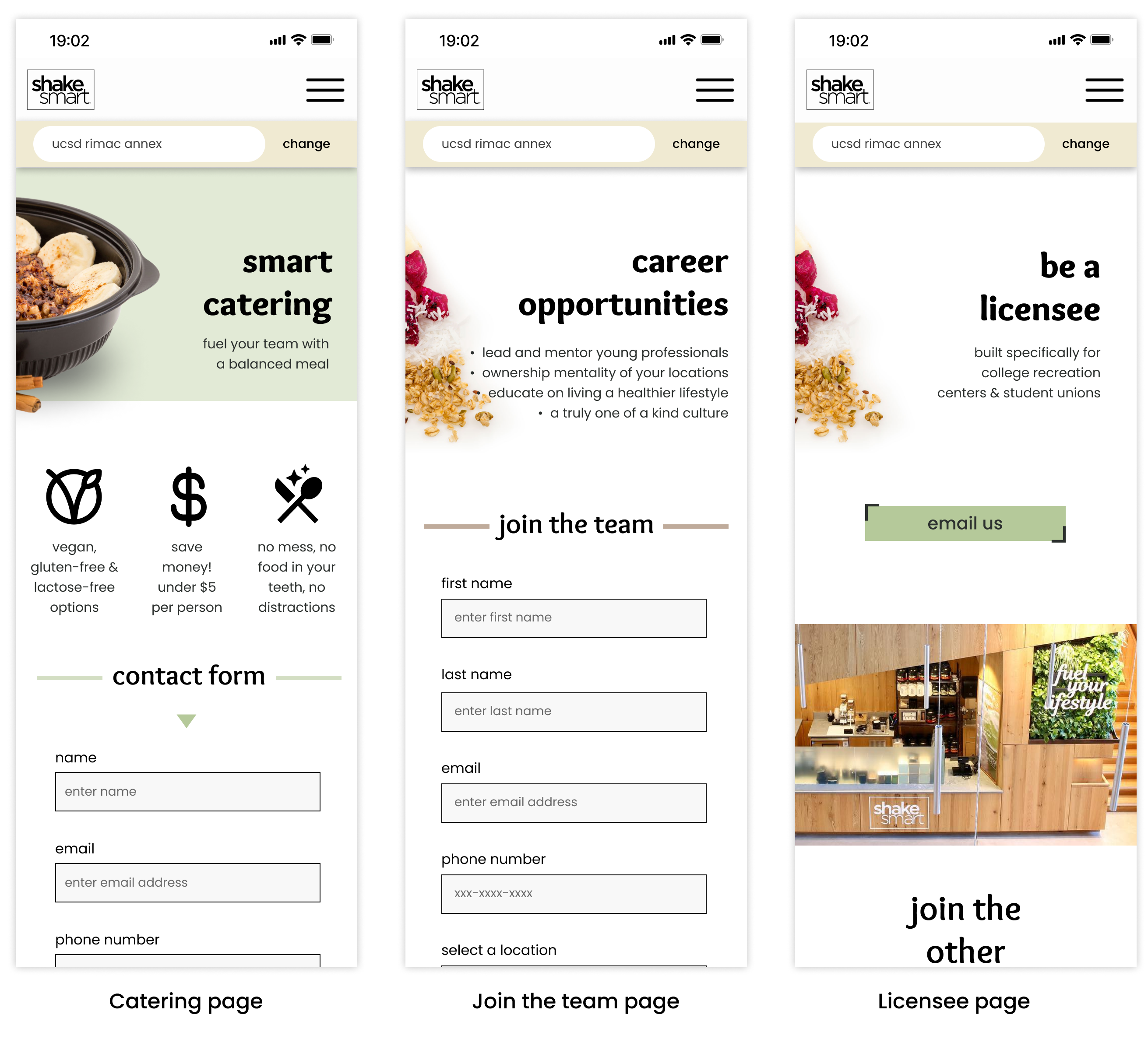
With a clear understanding of Shake Smart's site structure, we worked together to create low fidelity wireframes for the mobile site first as we thought it would be easier to upscale to a desktop rather than vice versa.
Mobile Wireframe
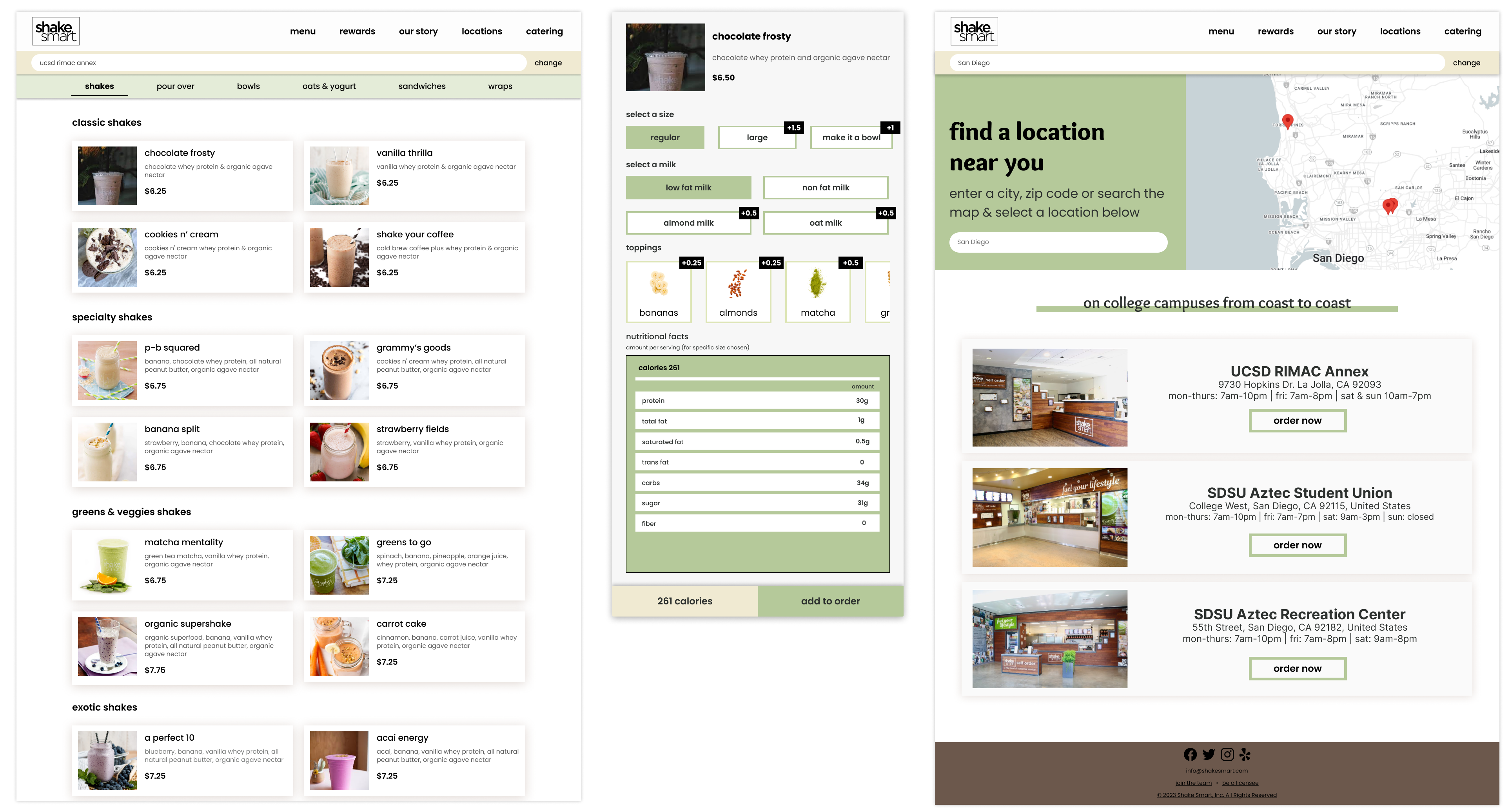
Desktop Wireframe
To test our low fidelity wireframe, we asked 4 participants to give us feedback on both the mobile and desktop site. The participants helped us pinpoint areas of confusion when navigating through the site and gave us ideas for improvement.
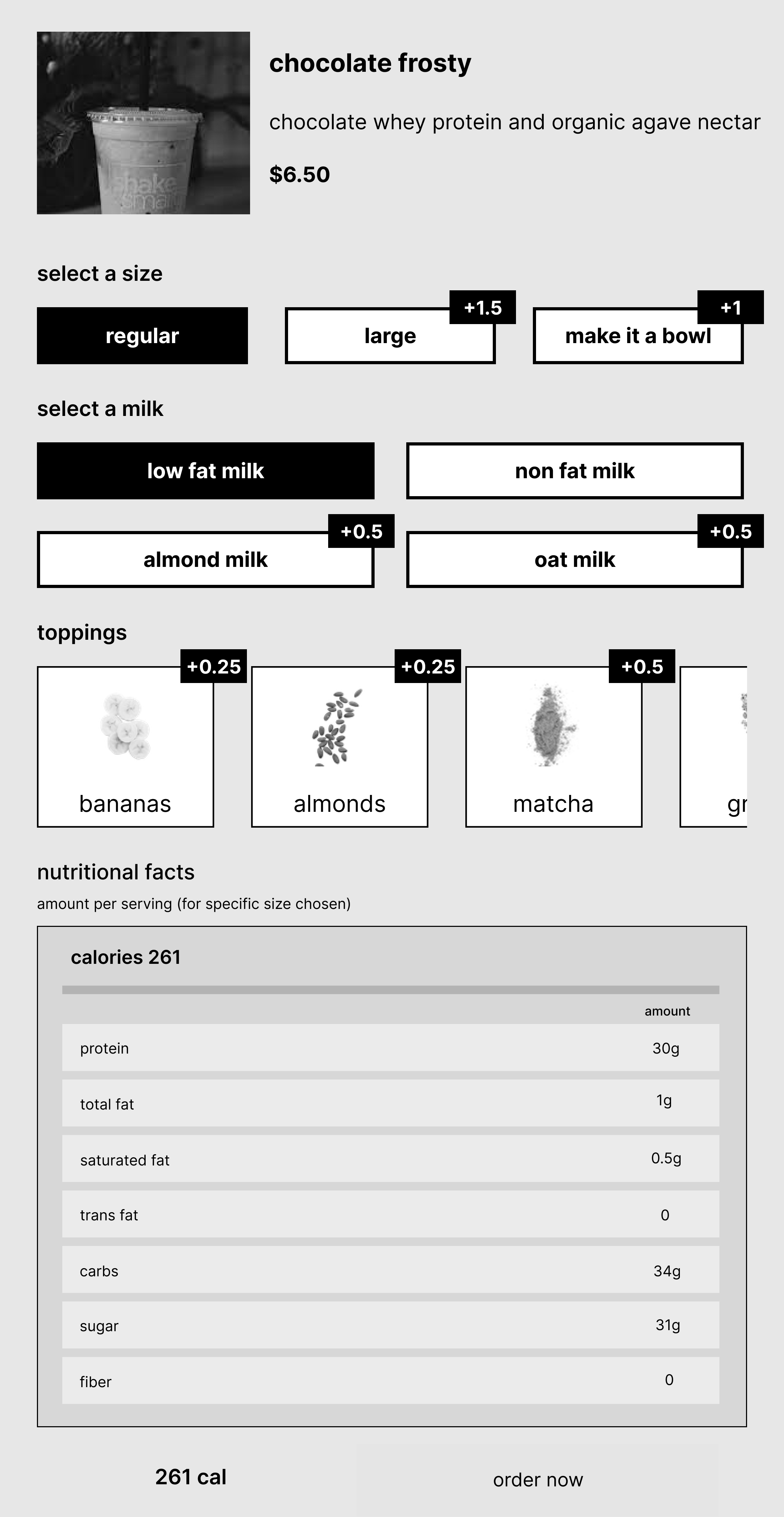
Feedback 1: "Redundancy of individual item customization on both menu and order is unnecessary."
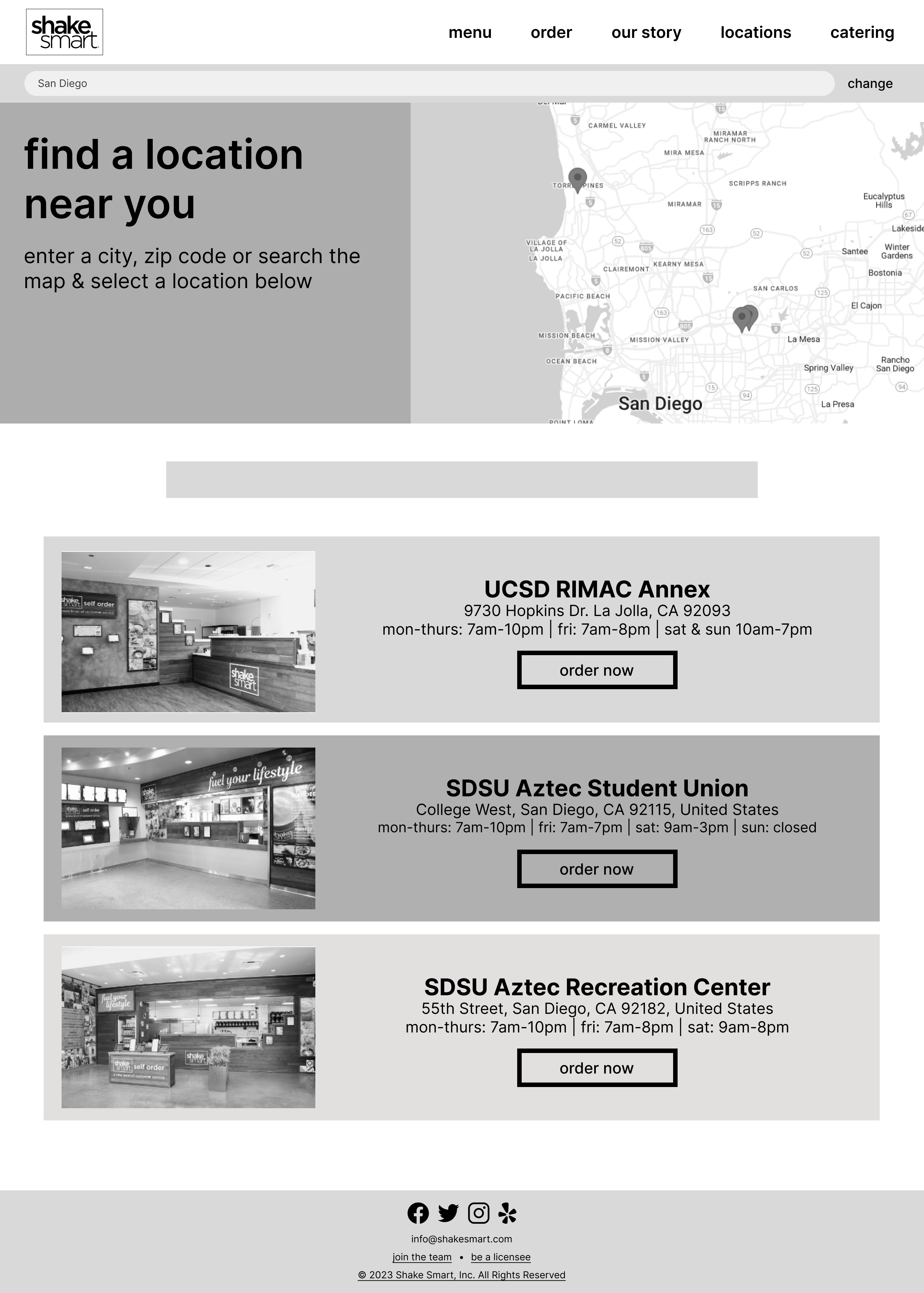
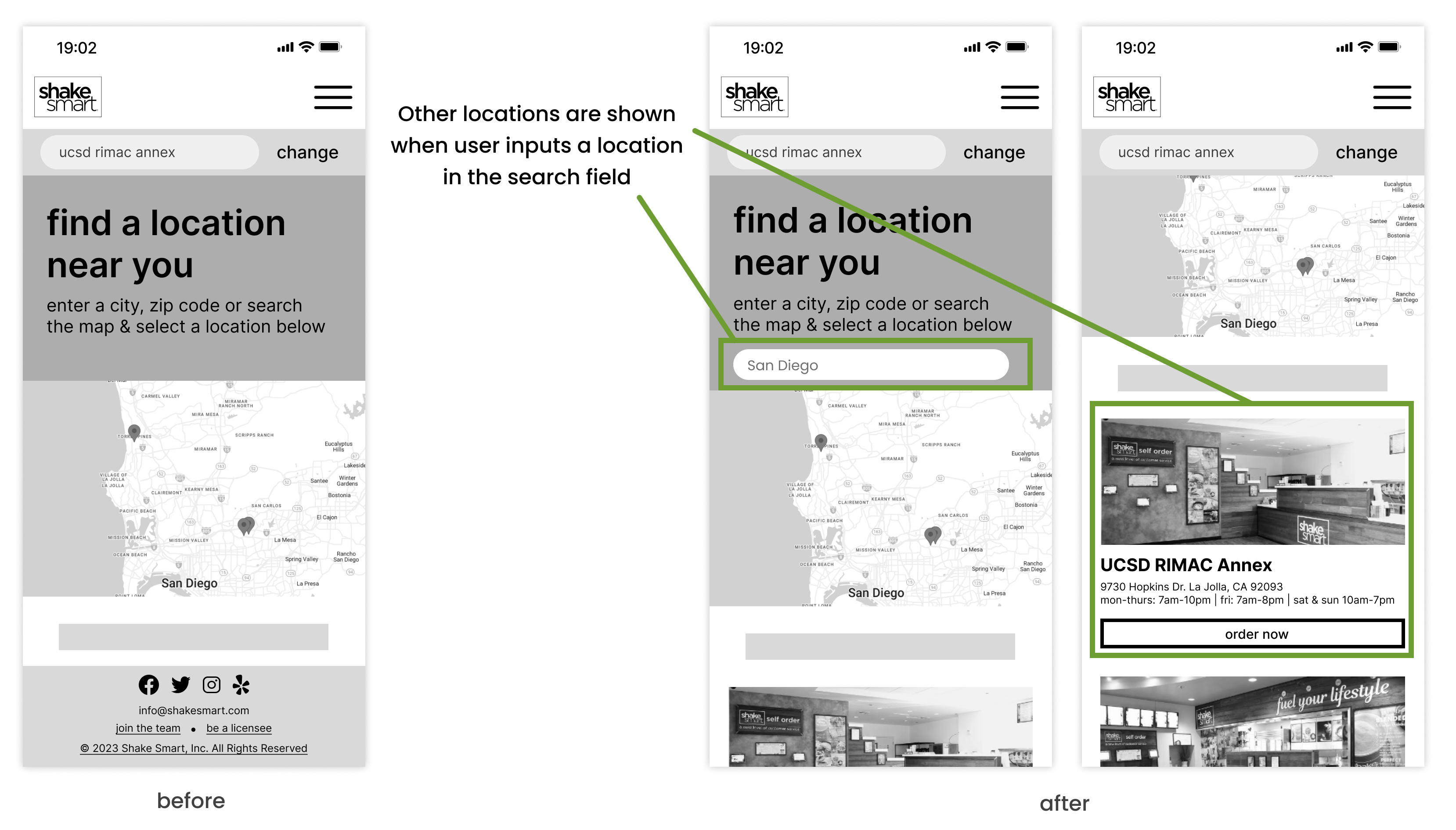
Feedback 2: "Implementation of interactive map would improve the locations page."
Note: We could not implement a fully interactive map due to time limitation and UCSD location was our main focus.
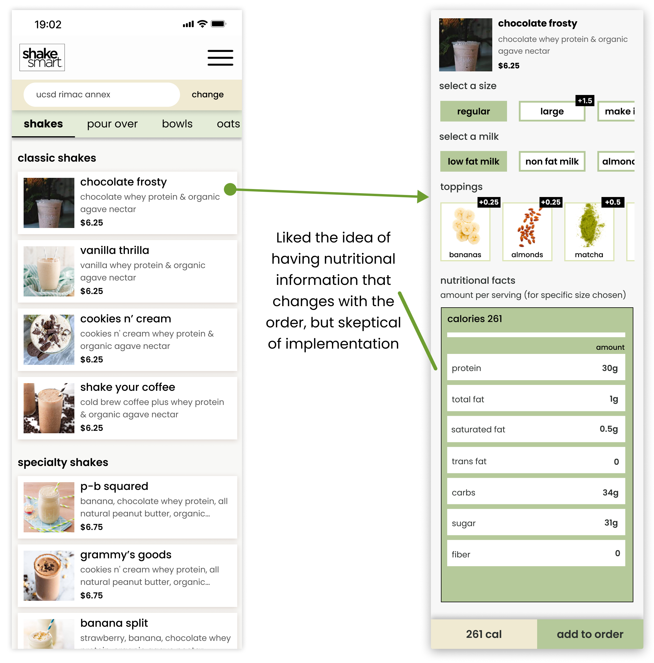
Feedback 3: "Everything looks kinda samey like the product name and description...I want to see the prices a bit better."
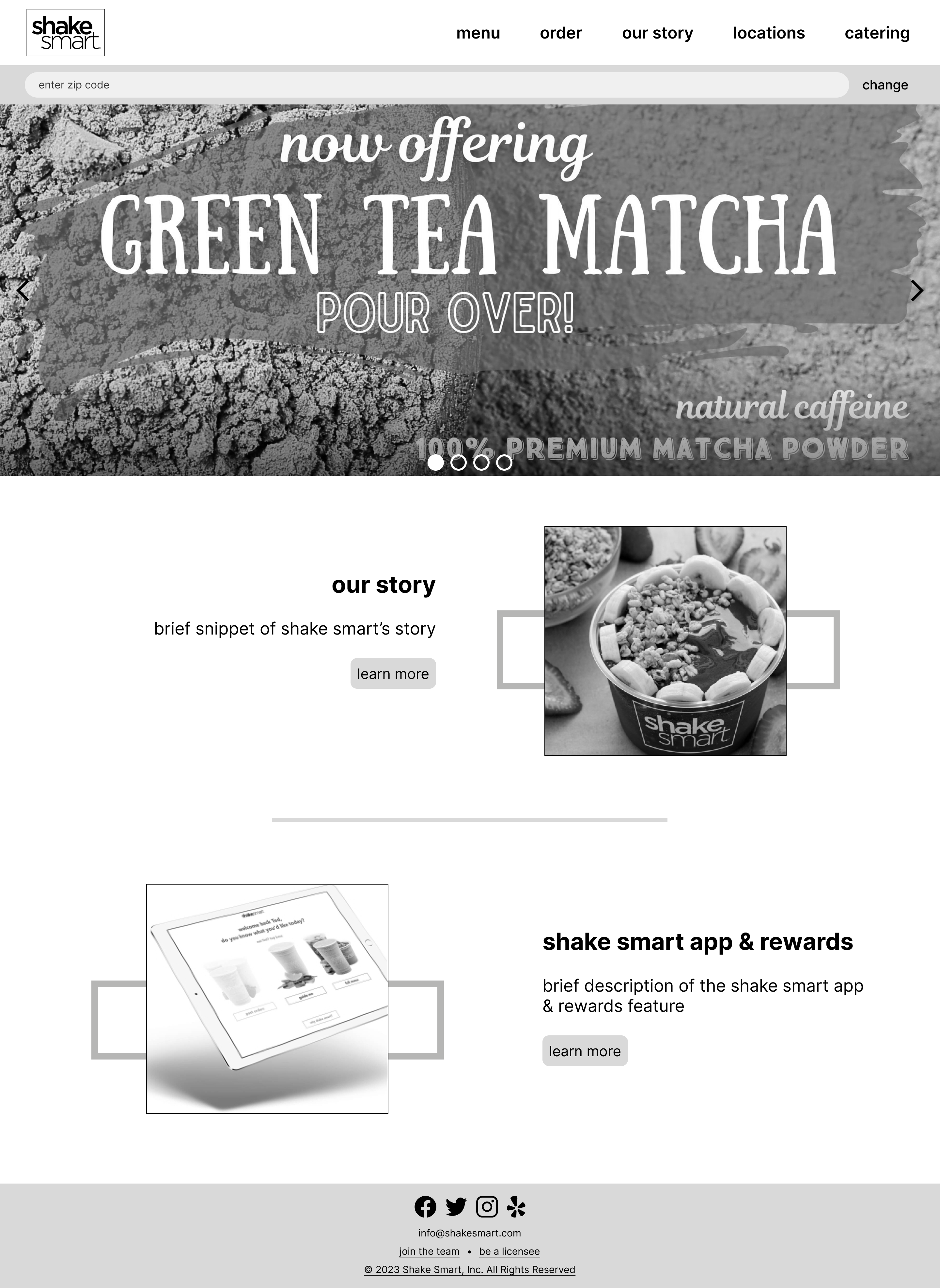
Desktop Site
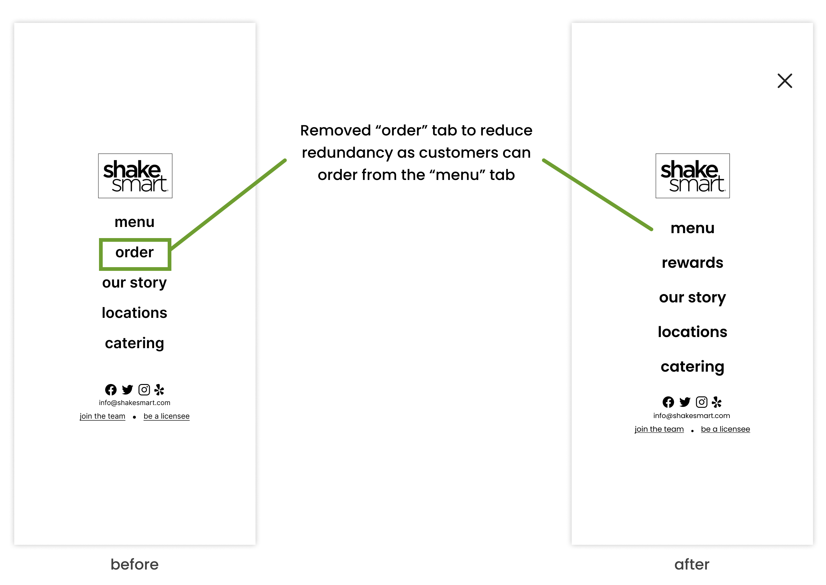
Feedback 1: Difficulty with finding rewards info that was not listed on the main menu. Make these more discoverable and reduce amount of steps required to get them there.
Note: Changes made on mobile were reflected to desktop as well.
Since the mobile and desktop site are essentially identical, the changes we made on mobile will reflect on the desktop site.
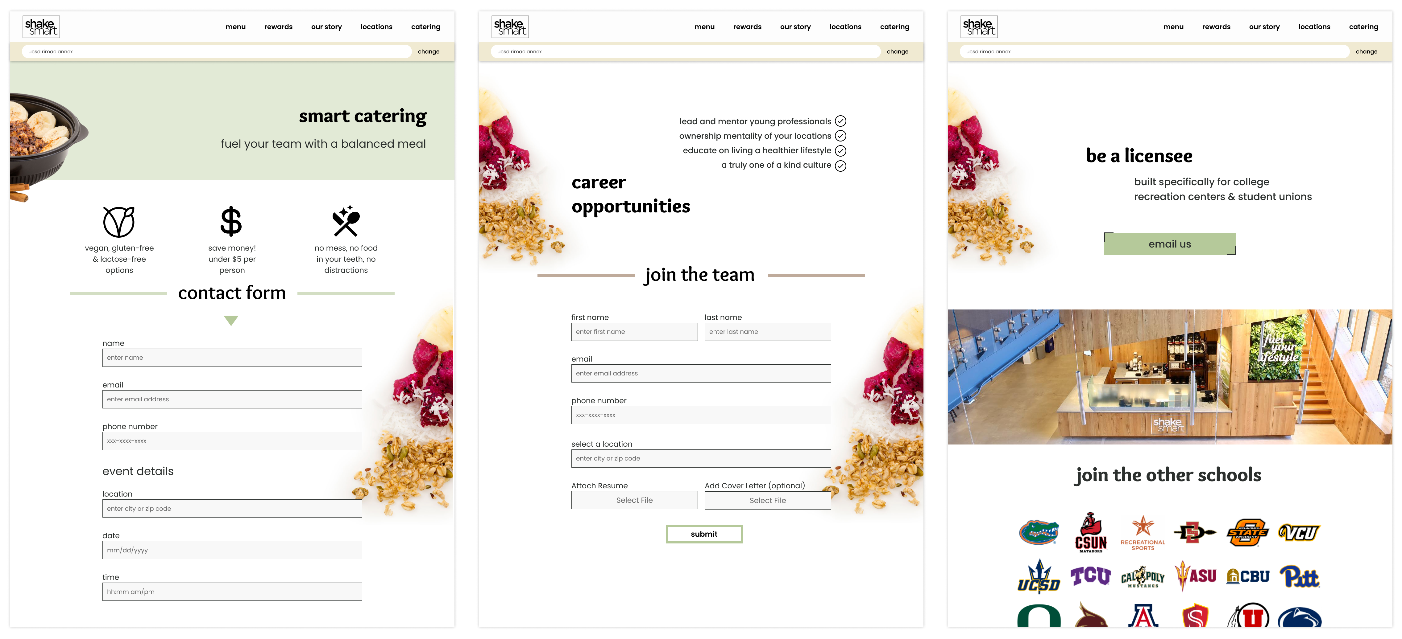
Some changes we made:
1. Changed color scheme based on meeting with client
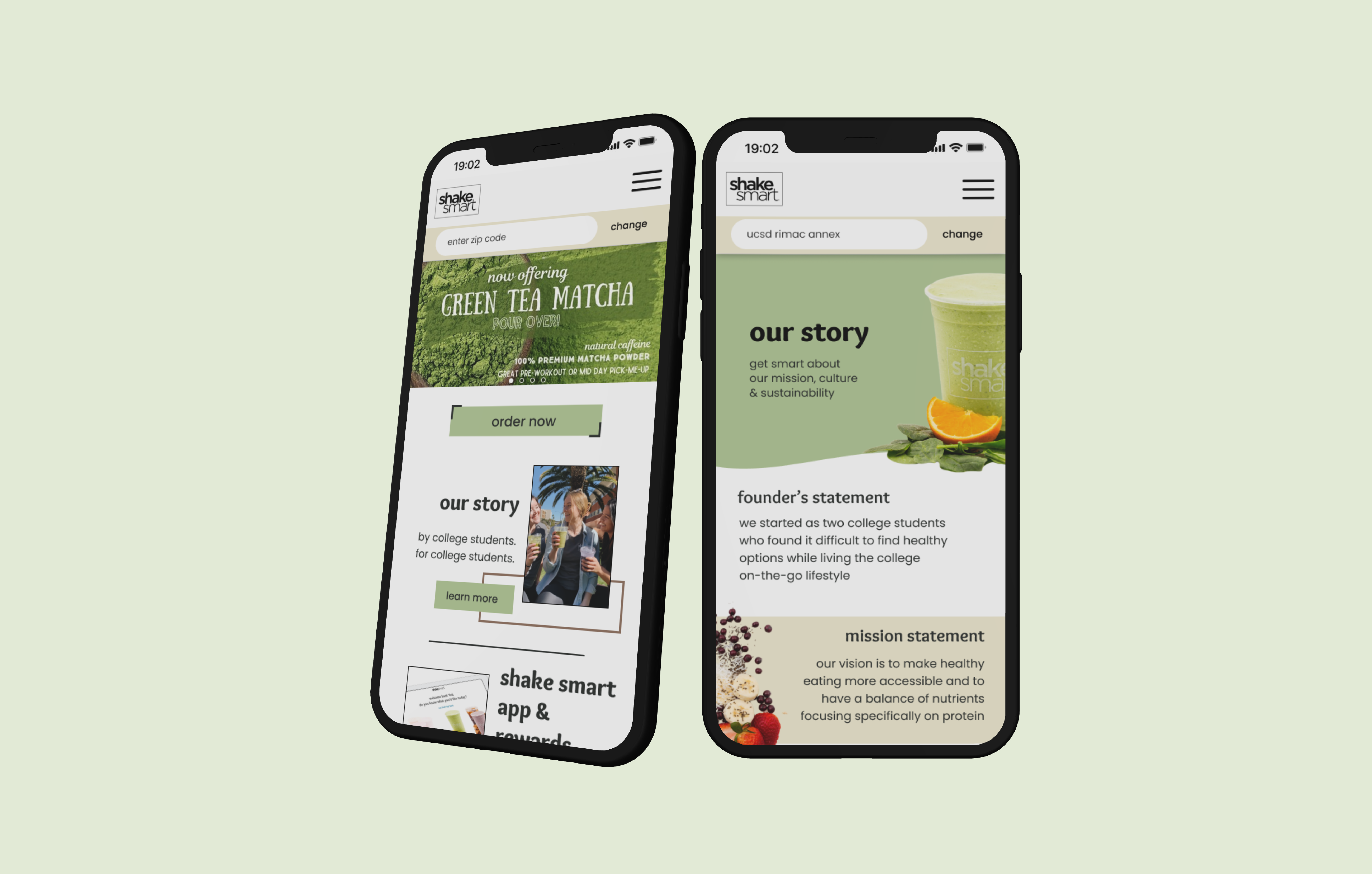
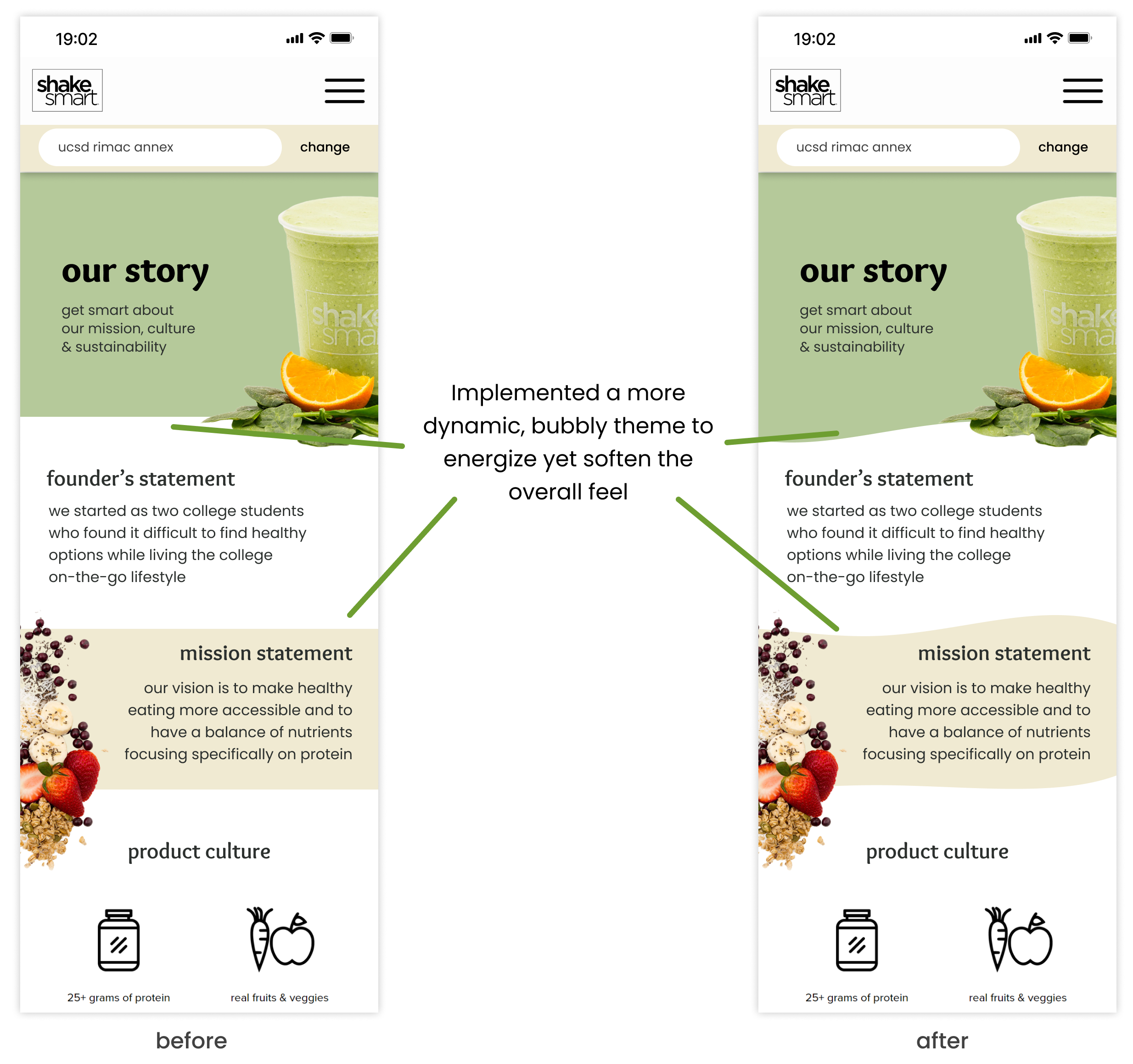
2. Redesigned background visual and added appropriate images for each page
3. Added images for each product and fleshed out customization feature
4. Made featured product carousel on home page rotate automatically or with user interaction
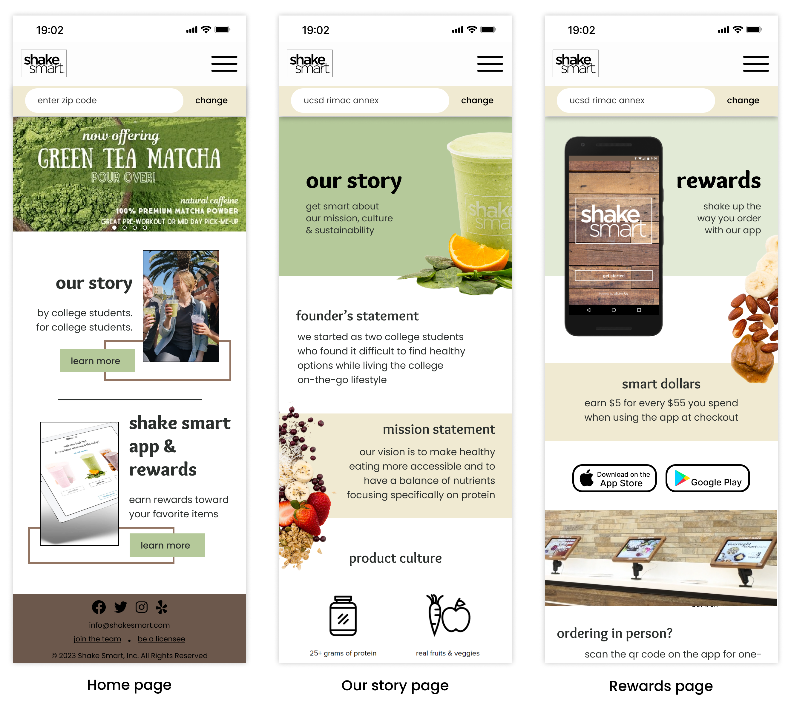
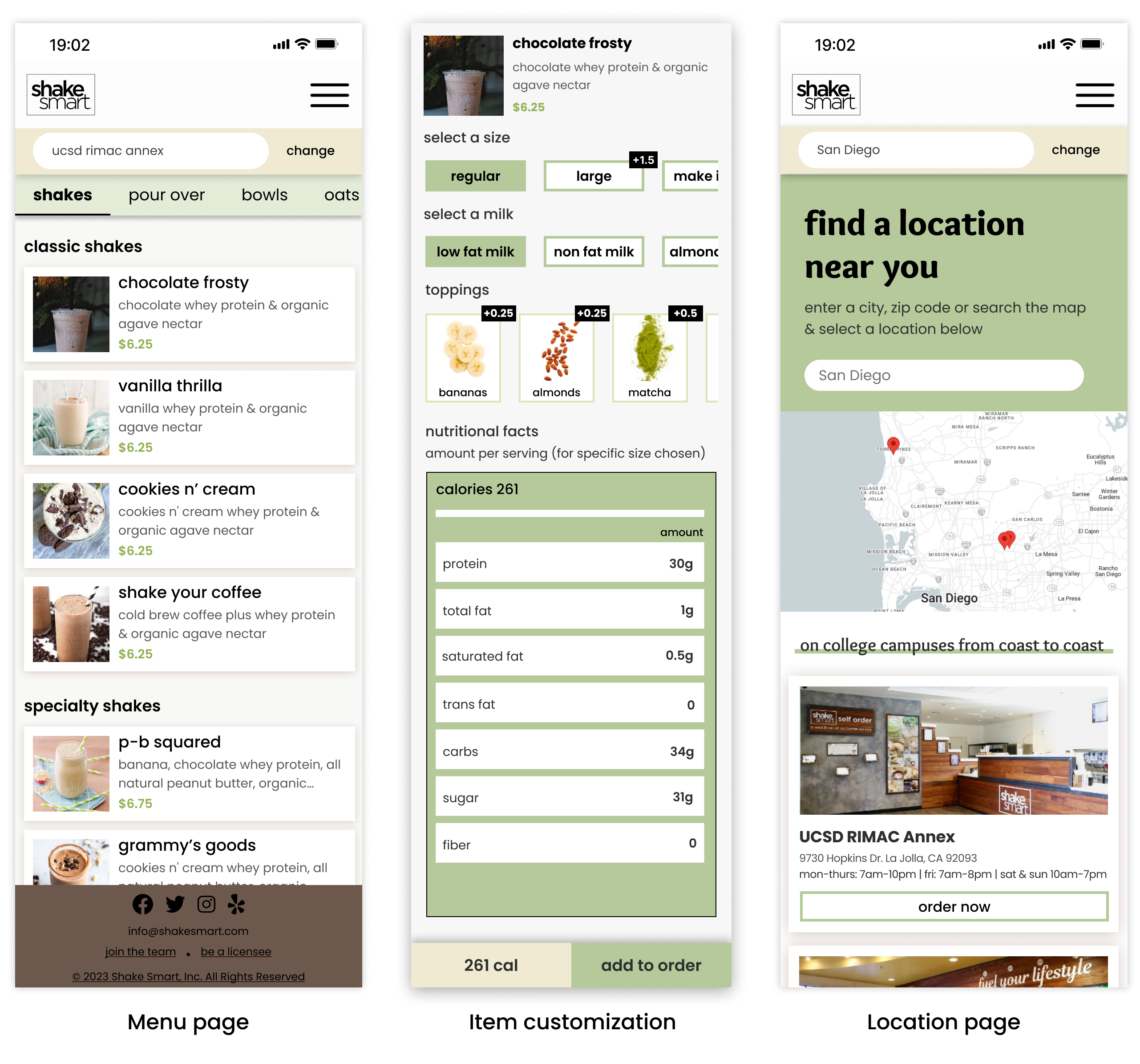
Same changes were made from mobile to desktop. Click the images for better resolution!
.png)
We decided to conduct another around of user testing with our high fidelity prototype. Our users were very pleased when navigating through the site, however, some mentioned just wanting to order right away. Some users also prefer navigating through the footer if they're at the bottom of the page.
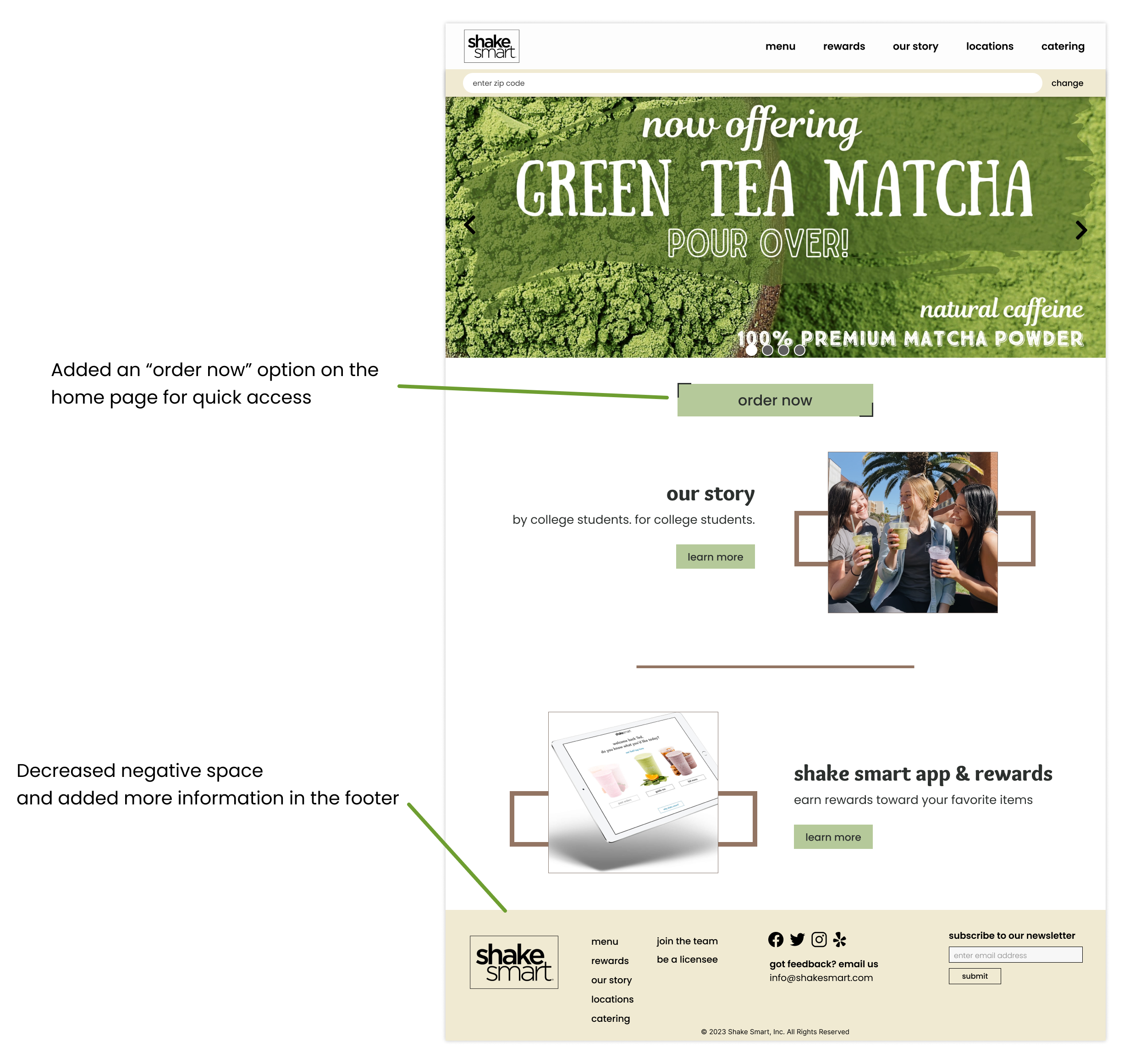
Our client was pleased with our redesign as we incorporated images that effectively communicate the brand messaging while keeping it minimal as to not overwhelm the users. She was skeptical about some features such as responsive nutritional information and locations due to the developer's use of WordPress.
After going through the feedback we got, we started making changes for our final design. There were some features that we could not implement due to time and technology constraints. These changes made in the mobile site are reflected in the desktop version as well.
This was the first time that I worked with a real client to redesign their website. The biggest challenge was trying to decide on a middle ground between the client's needs and the customers' needs. Customers may want a specific feature, but if the client is against it, then we must respect the client's decision and find a different way to design the feature.
Throughout the project, I played a significant part in developing the user interface portion of our wireframes and prototypes. This extensive involvement allowed me to refine my design skills and practice new techniques such as utilizing auto layout for responsive design and creating scrollable frames in Figma.