
.png)
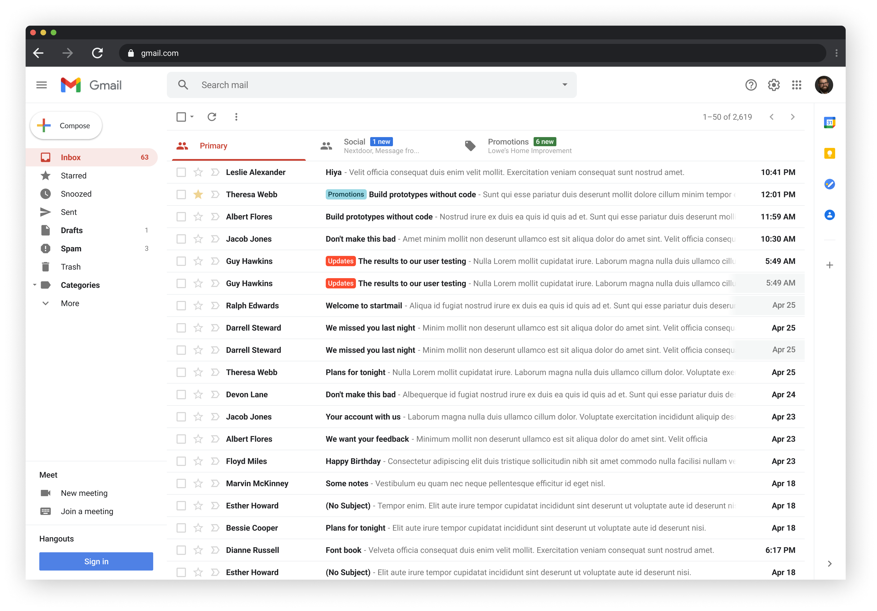
Every year, internet users generate a staggering 1.6 billion tons of carbon emissions, and the average carbon footprint of a person's email usage ranges from 3 to 40 kilograms of CO2e. This is comparable to driving a small gasoline-powered vehicle for anywhere from 10 to 128 miles! Despite this alarming fact, the largest group of email users, Gmail users, remain uninformed about the potential carbon footprint of their unread emails. After speaking to many Gmail users, it was clear that they lack the motivation to declutter their cluttered inboxes, citing multiple email accounts and an inundation of spam emails as contributing factors.
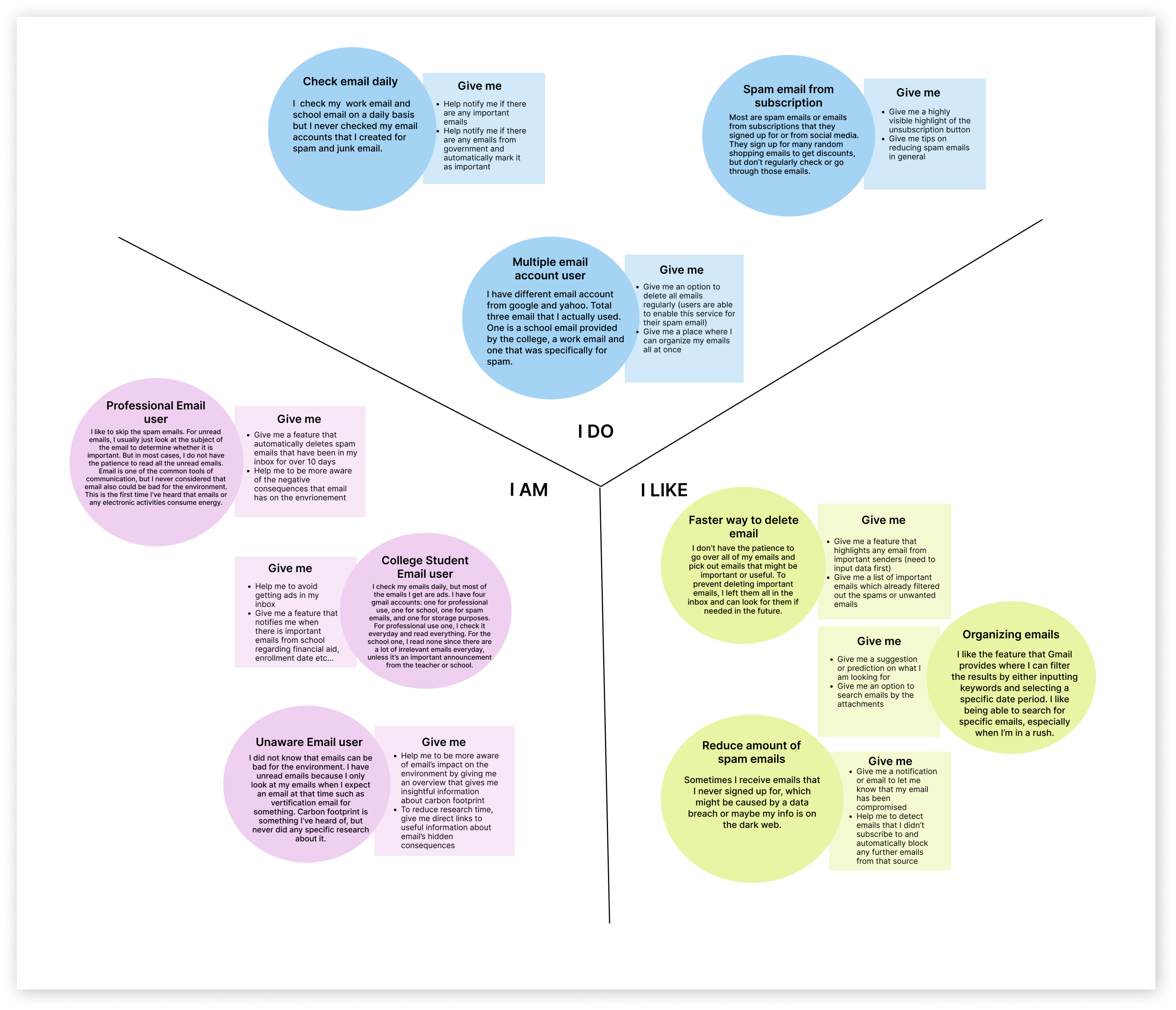
To gain a better insight of how users interact with Gmail and their knowledge regarding the subject, our team carried out two interview rounds with 12 Gmail users. We utilized an affinity diagram and identity model to organize all the gathered data.
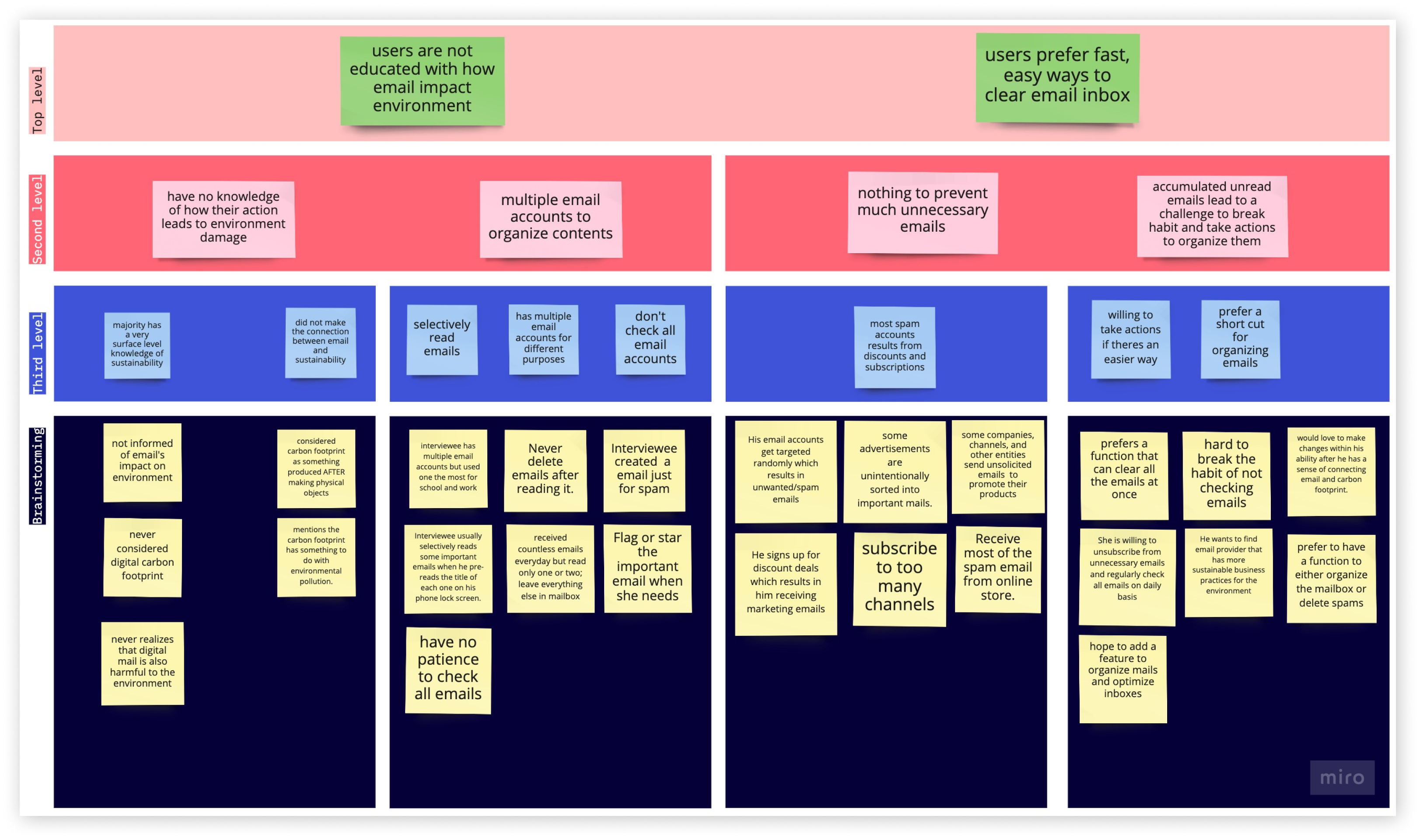
We ended up with 4 main findings:
When asked if they will make a change in their action after learning about its damage, 5/12 users stated that they will not. This lack of incentive for initiating actions made us question the reasons behind it, and we believe that the root of the problem is a human problem:


Goal 1: Increase users' awareness of their environmental impact
Goal 2: Streamline the inbox cleaning process for efficiency
Goal 3: Establish sustainable inbox cleaning practices for long-term use
Our team generated multiple concepts for the final product and selected the following three options. We carried out one user survey to obtain feedback.
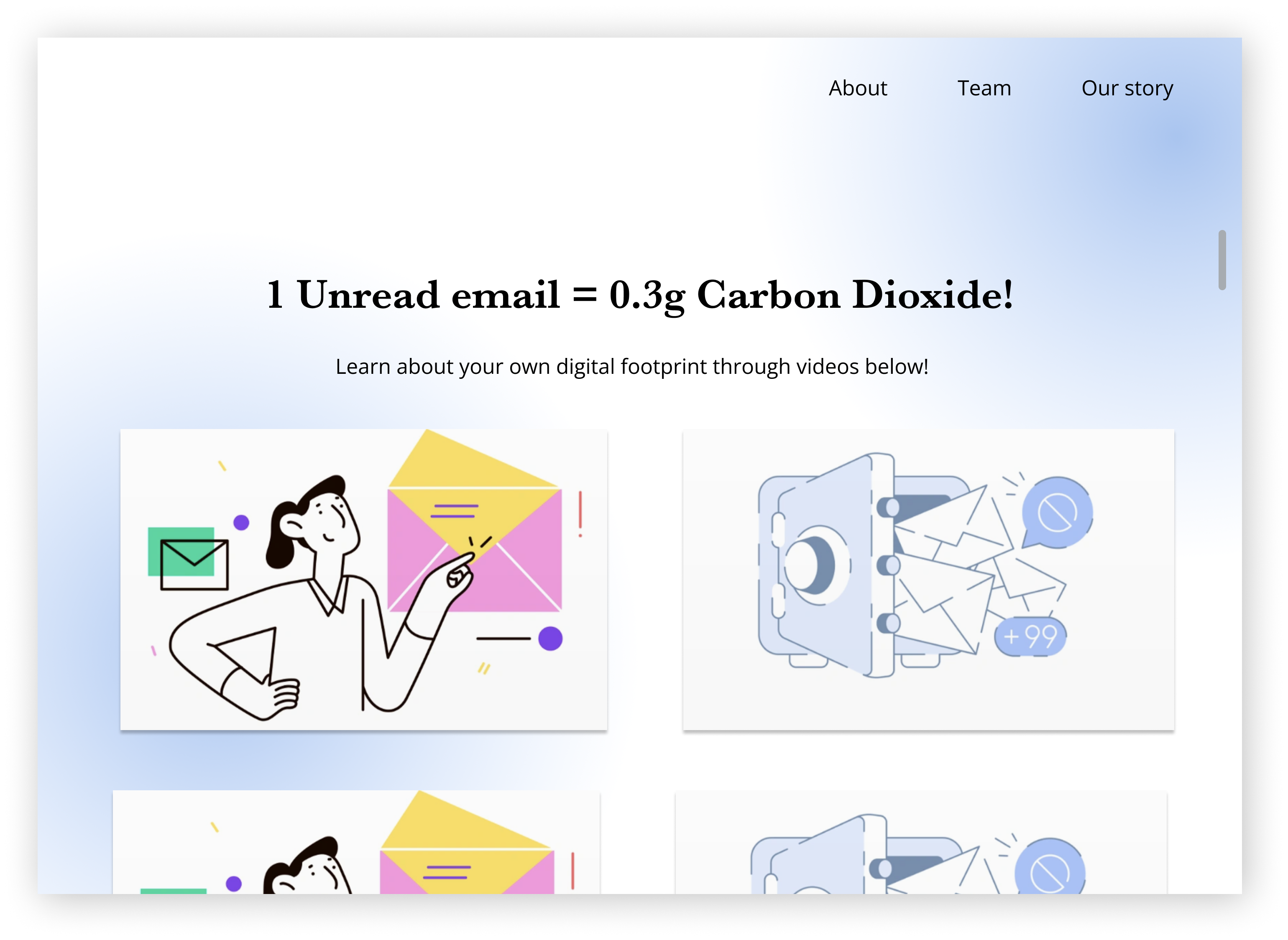
An educational website that employs animations to demonstrate environmental impact and offers external links to assist users in organizing their emails. However, users without prior knowledge of the website may have difficulty accessing it.
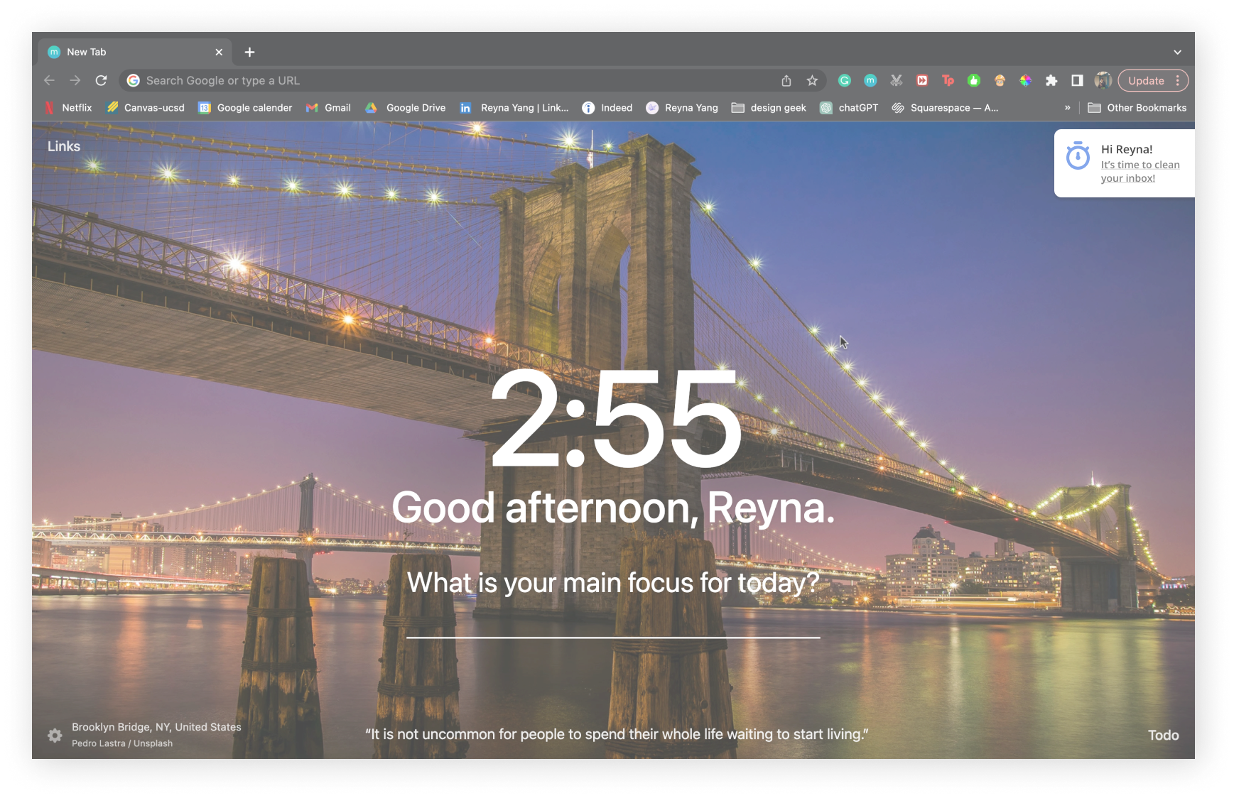
A Chrome extension that acts as a reminder for users to check their emails. However, feedback indicates that users may become annoyed and remove the extension.
Enhance the Gmail interface by offering educational information and new features for organizing email inboxes. This would allow users to take action directly within the interface without having to navigate elsewhere.
After considering all three options, we opted for the third one- adding new features to the Gmail interface. While the educational website and Chrome extension have their own merits, we decided that leveraging Gmail's extensive user base would be the most effective way to educate and assist as many users as possible.
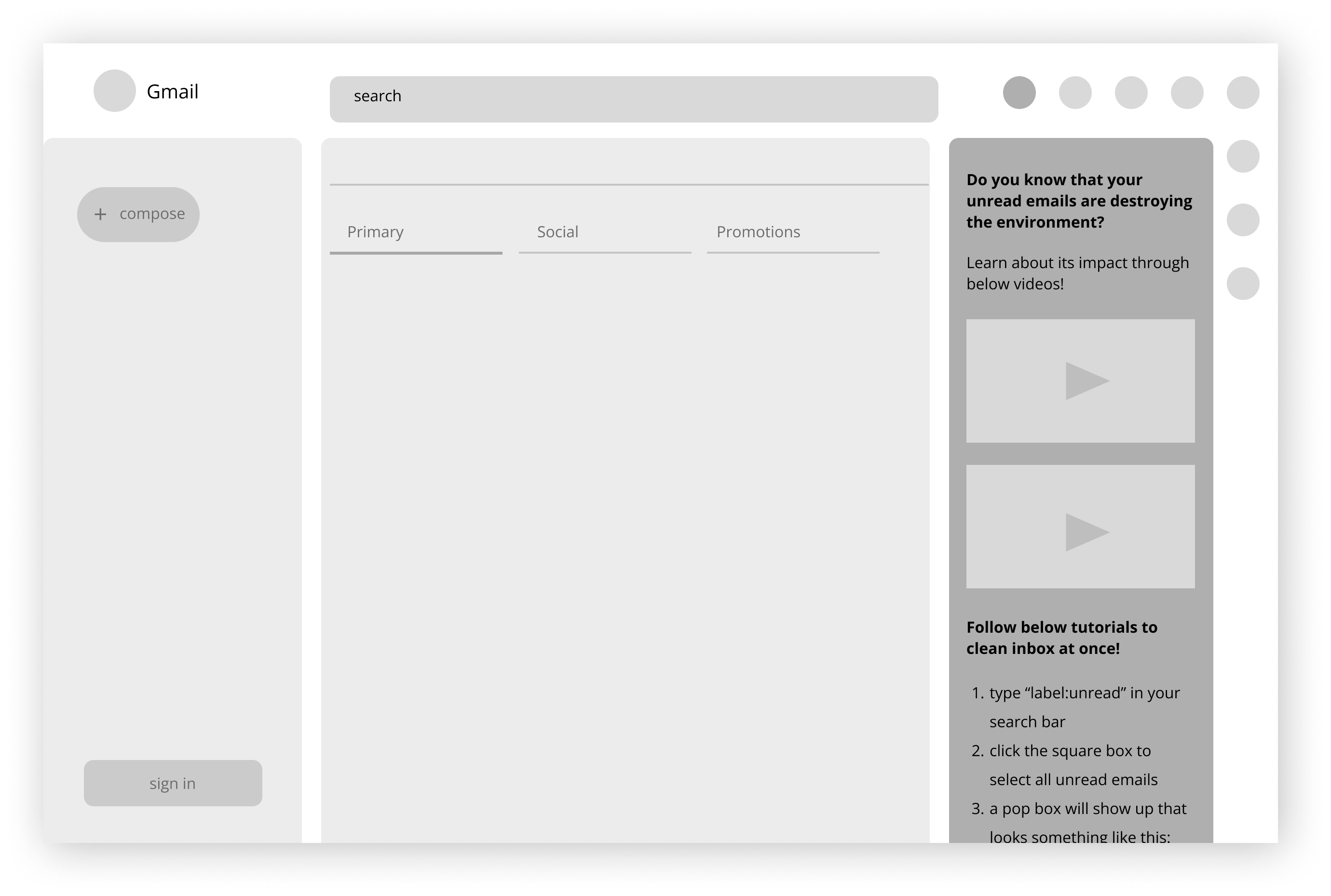
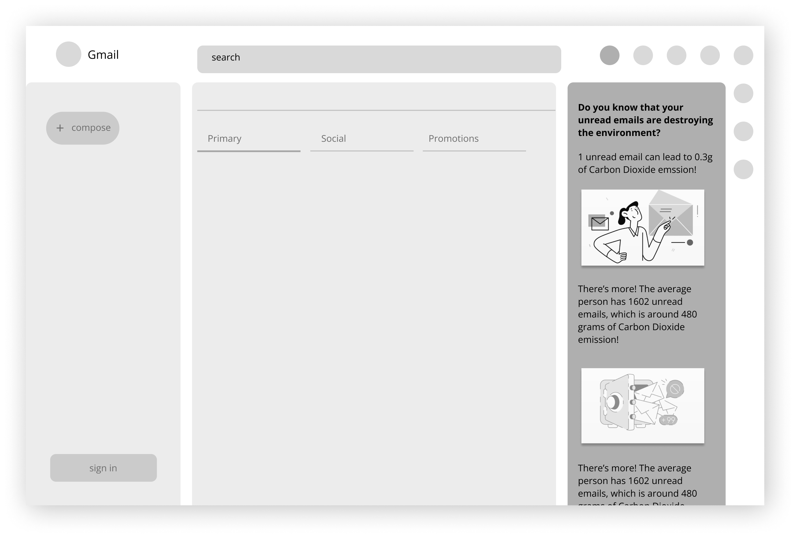
To educate users - Provide a captivating headline, brief info, and a video on the topic in the side panel.
To clean inbox - Provide picture tutorials on Gmail’s existing shortcut that reads all emails at once.
To reduce spam - Have an unsubscribe/block feature where potential spam providers/unwanted subscriptions will be detected for users to unsubscribe/block.
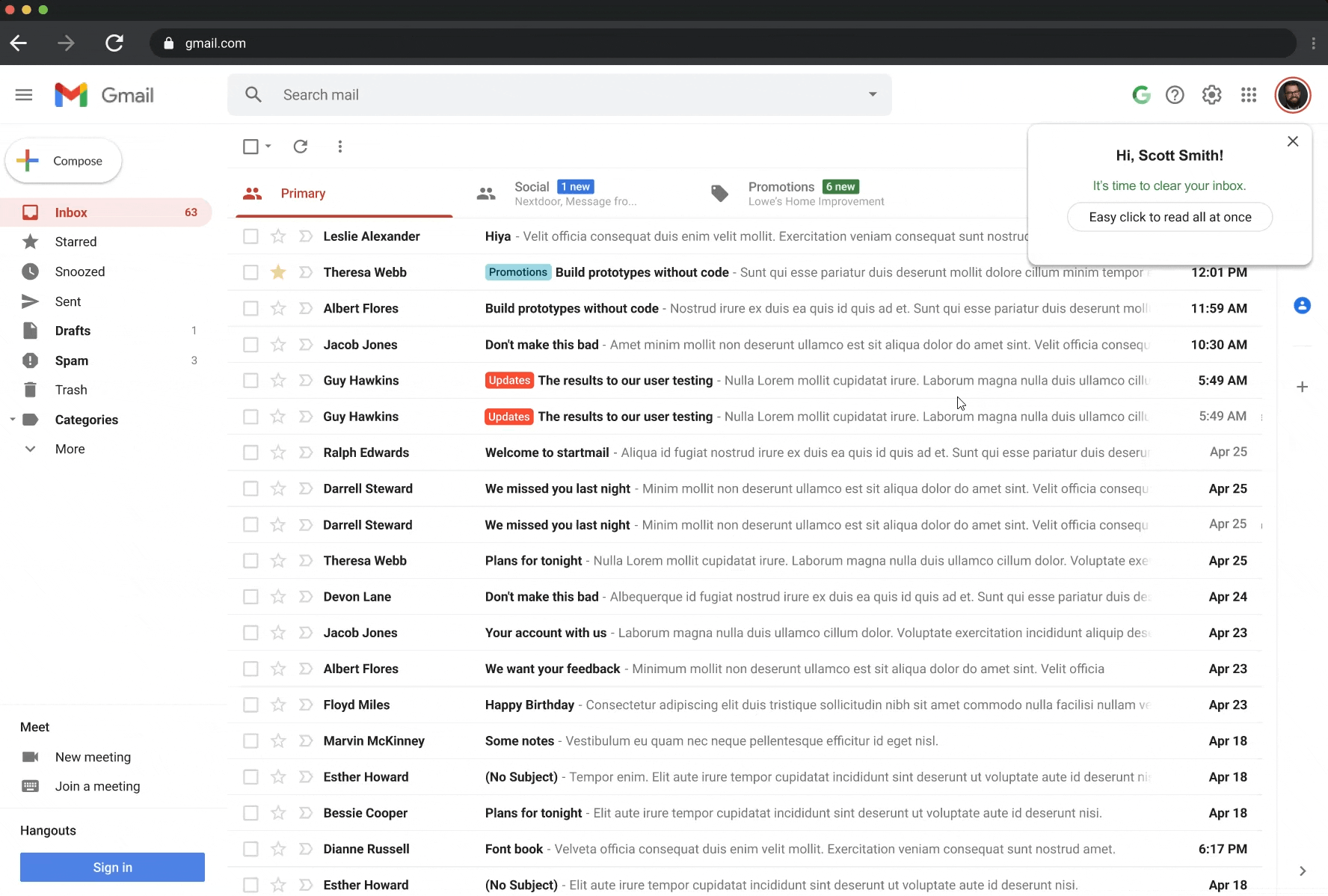
To build habits - Pop-up reminder that reminds users to clean inboxes.
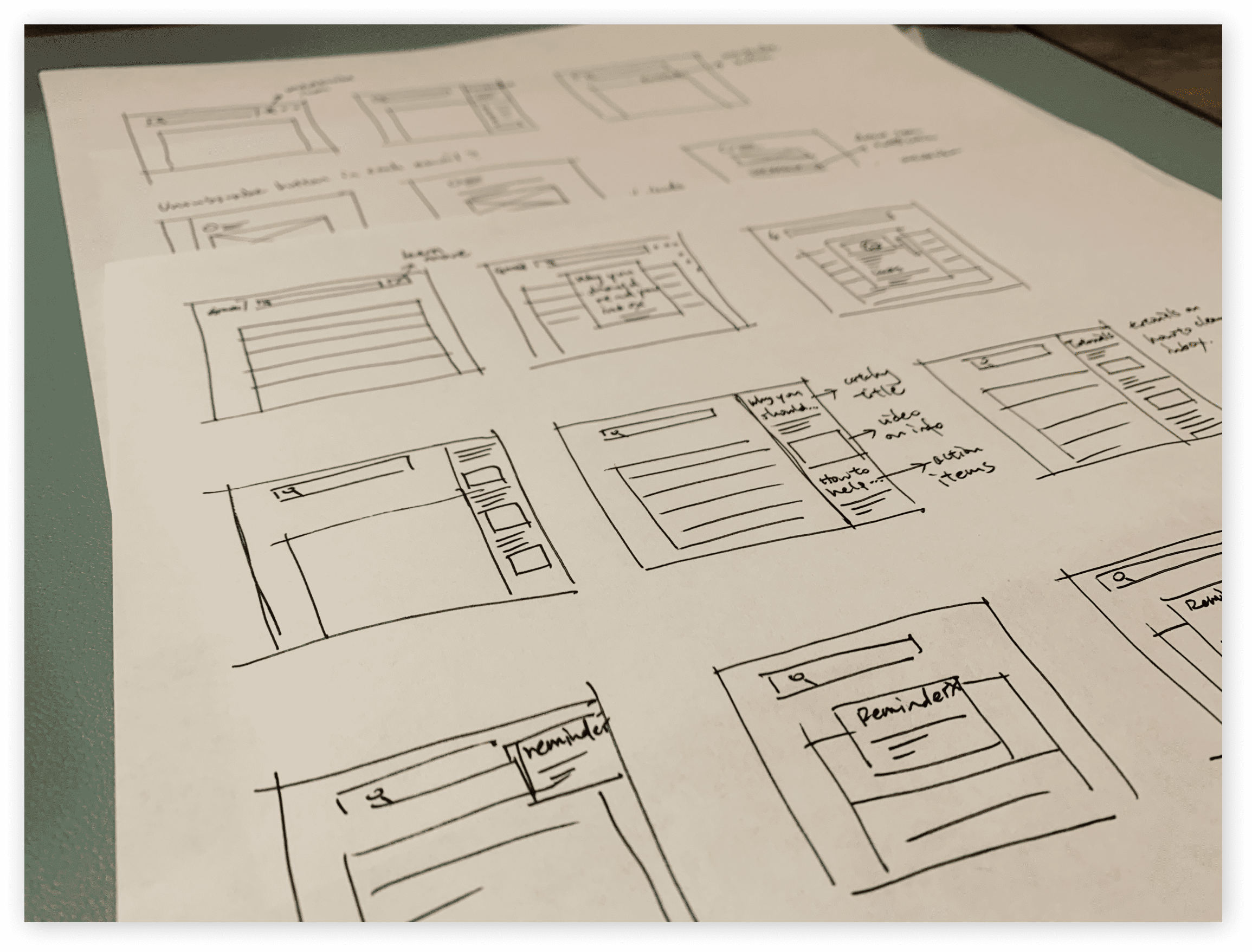
Following our wireframes, we began our mid-fidelity design on Figma and performed another round of user testing to confirm that our concepts were aligned with user needs before moving on to high-fidelity design.
Feedback 1:
“I would skip the video since it takes time to load and just seems inconvenient."
--------------------------------------------------------------------------------------------------------------------------------------------------------------------------------------------------------------------------------------------------------------------------------------------------------------
The “Aha” moment
We soon came to the realization that educating users through videos or graphics might not be the best option, as they are passively receiving information. What we need is to inspire them to take action on their own.
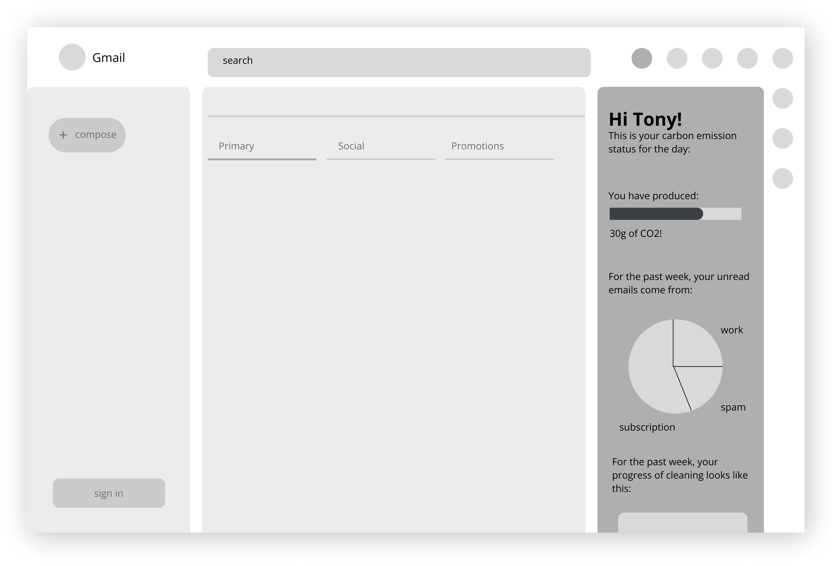
As a result, we came up with the idea of creating a personal dashboard that helps users visualize their impact on the environment. This gives them a direct sense of making changes, thus increasing their incentive to make a change!
Pictures have the same problem as video - users are passively receiving information.
Personal dashboard increases users’ incentive to make actions as they can directly see the changes!
-------------------------------------------------------------------------------------------------------------------------------------------------------------------------------------------------------------------------------------------------------------------------------------------------------------
Feedback 2:
“That pop-up box feels like an ad. It’s distracting."
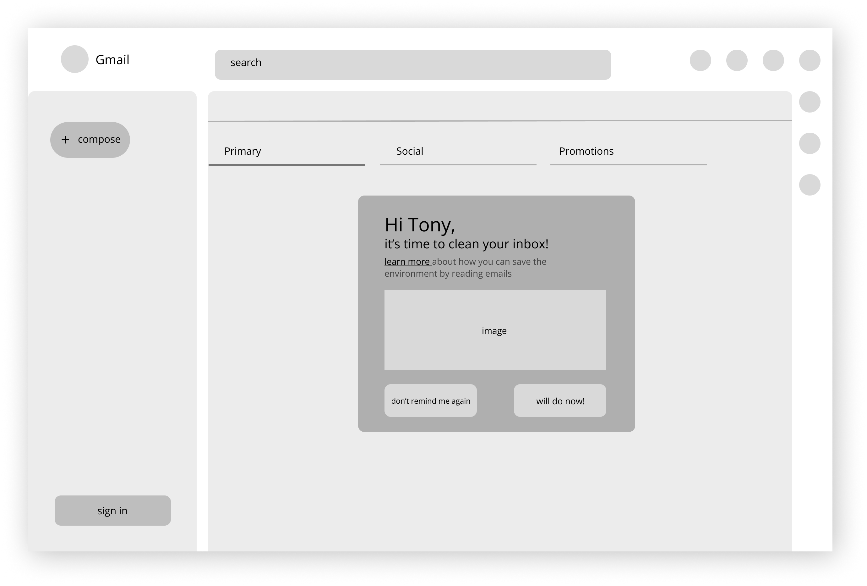
Our solution
Reminder is essential for users to feel the need to take action and build lasting habits, yet users wanted them to be subtle and not distractive. As a result, we created a more comfortable reminder feature by:
Minimize reminder’s presence by moving it to the side and make it smaller.
More personalization settings for the reminder feature.
-------------------------------------------------------------------------------------------------------------------------------------------------------------------------------------------------------------------------------------------------------------------------------------------------------------
Feedback 3:
"The tutorial is kinda long to read and I don’t think I have the attention span for it. Is there an easier way?”
Our solution
Users believe that reading tutorials on how to clean inboxes is a hustle. We believe it is not a cognitively efficient solution either, plus tutorials only need to be read once and will end up useless anyways. As a result, we ended up with the decision to create a shortcut that helps users read all emails at once.
More personalization settings for the reminder feature.
-------------------------------------------------------------------------------------------------------------------------------------------------------------------------------------------------------------------------------------------------------------------------------------------------------------
Feedback 4:
“I like the unsubscribe feature. I have so many spam emails and subscriptions that I don’t remember, so I will definitely use this a lot!”
Our solution
We will keep this feature!
When designing the high fi prototype, we did a round of A/B testing on variations of the signifiers. Here are a few more iterations:
.png)
Change 1:
Adding color overlay when hovering indicates to users that it is clickable. The loading border we had earlier is more noticeable, but doesn’t tell users if it is clickable or not.
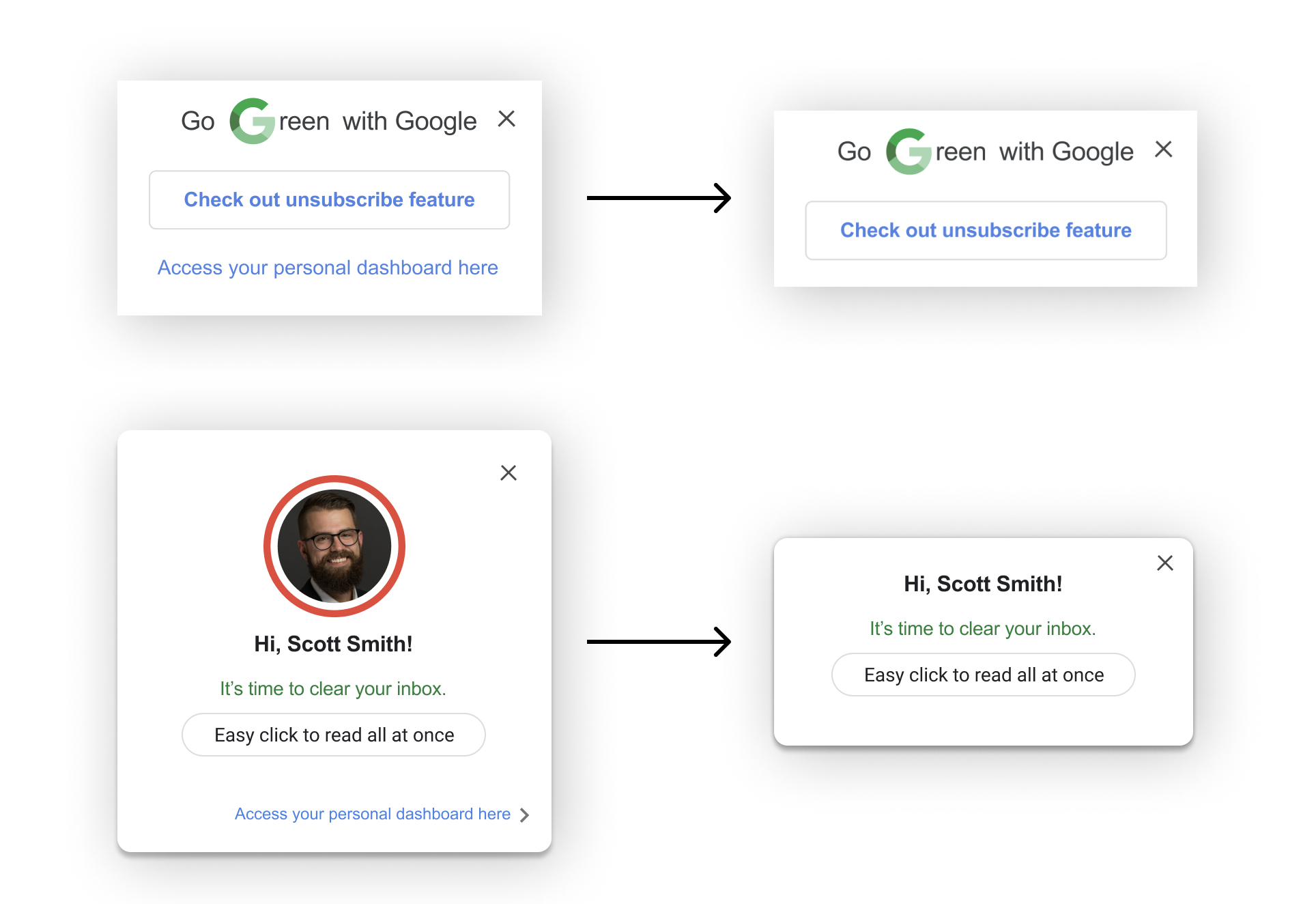
Change 2:
Removing unnecessary information and prioritizing one feature at a time reduces distractions and makes finishing tasks easier for users.
Onboarding feature to introduce what’s new
A walkthrough of new features to inform users of Google’s new focus on sustainability.
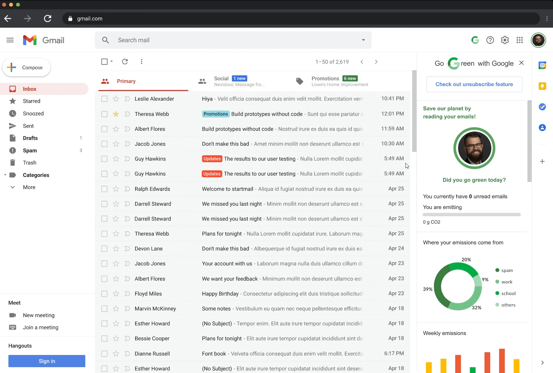
Personal Carbon Footprint Dashboard: Seeing changes as you clean inboxes
The dashboard is customized to each user, providing data on their CO2 emissions, amount of unread emails, categories of their emissions, and their weekly emissions.
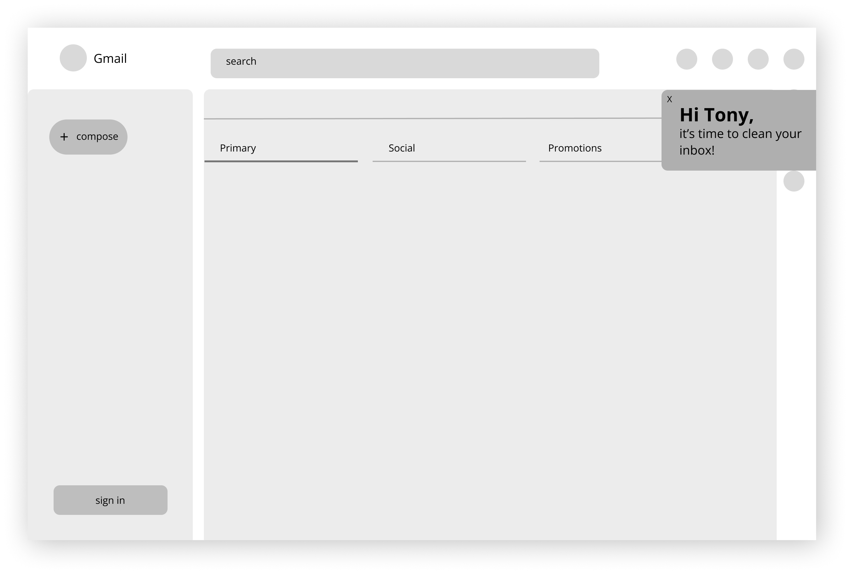
It's time to clean your inbox!
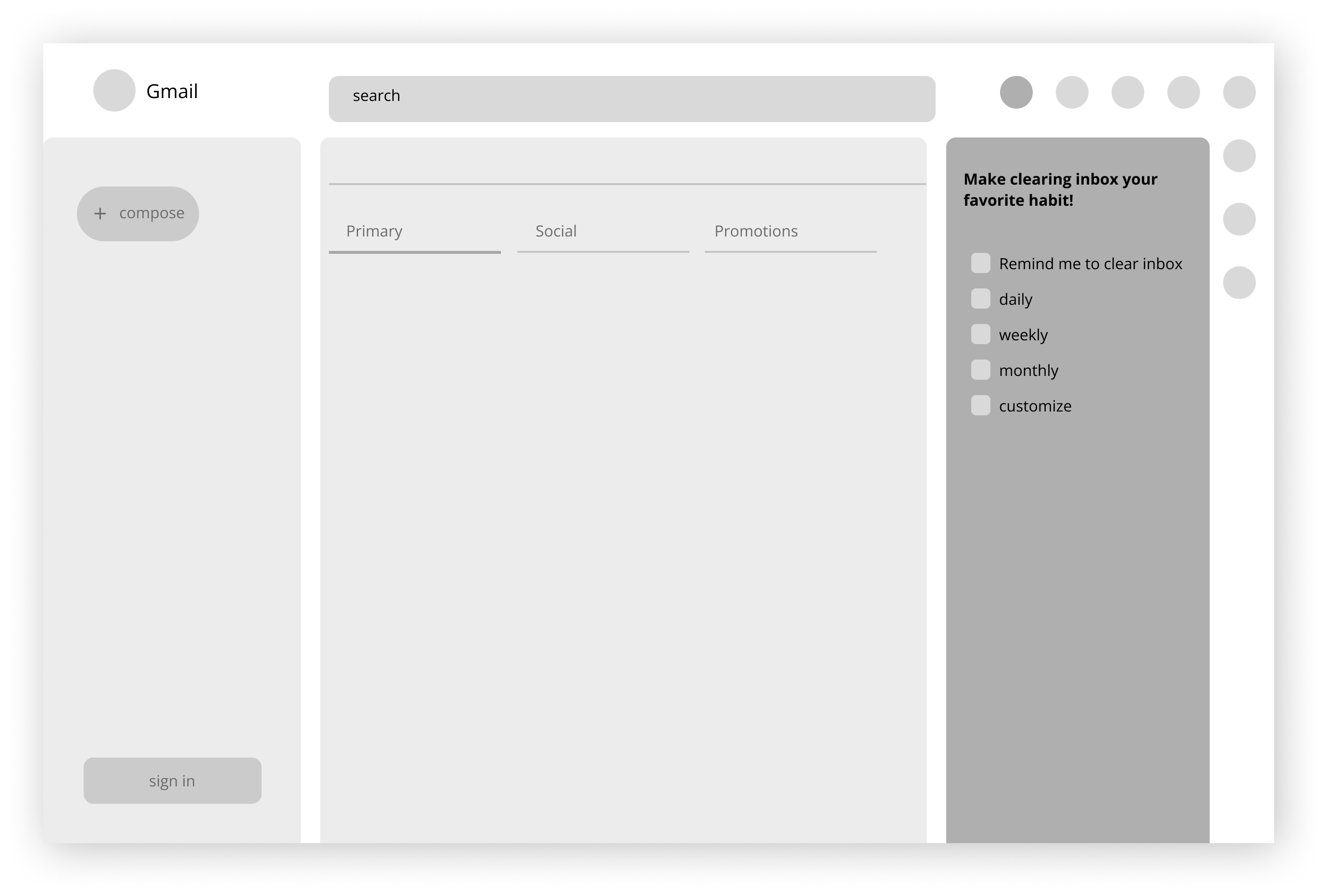
Users have the option to set up reminders that prompt them to clean their inbox on a daily, weekly, biweekly, or monthly basis. By providing users with this control, they are empowered to take charge of their own actions.
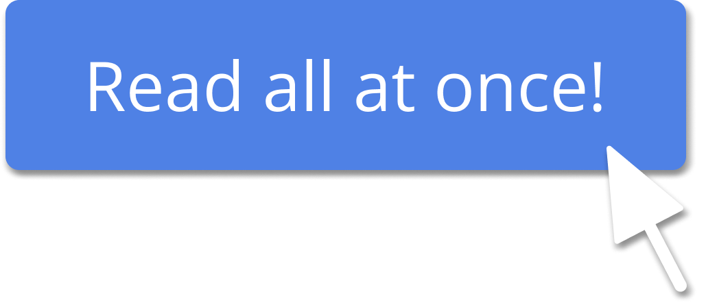
One button solves it all!
Upon receiving the reminder, users can easily access a shortcut to read all emails or use the read-all button directly from the reminder page.
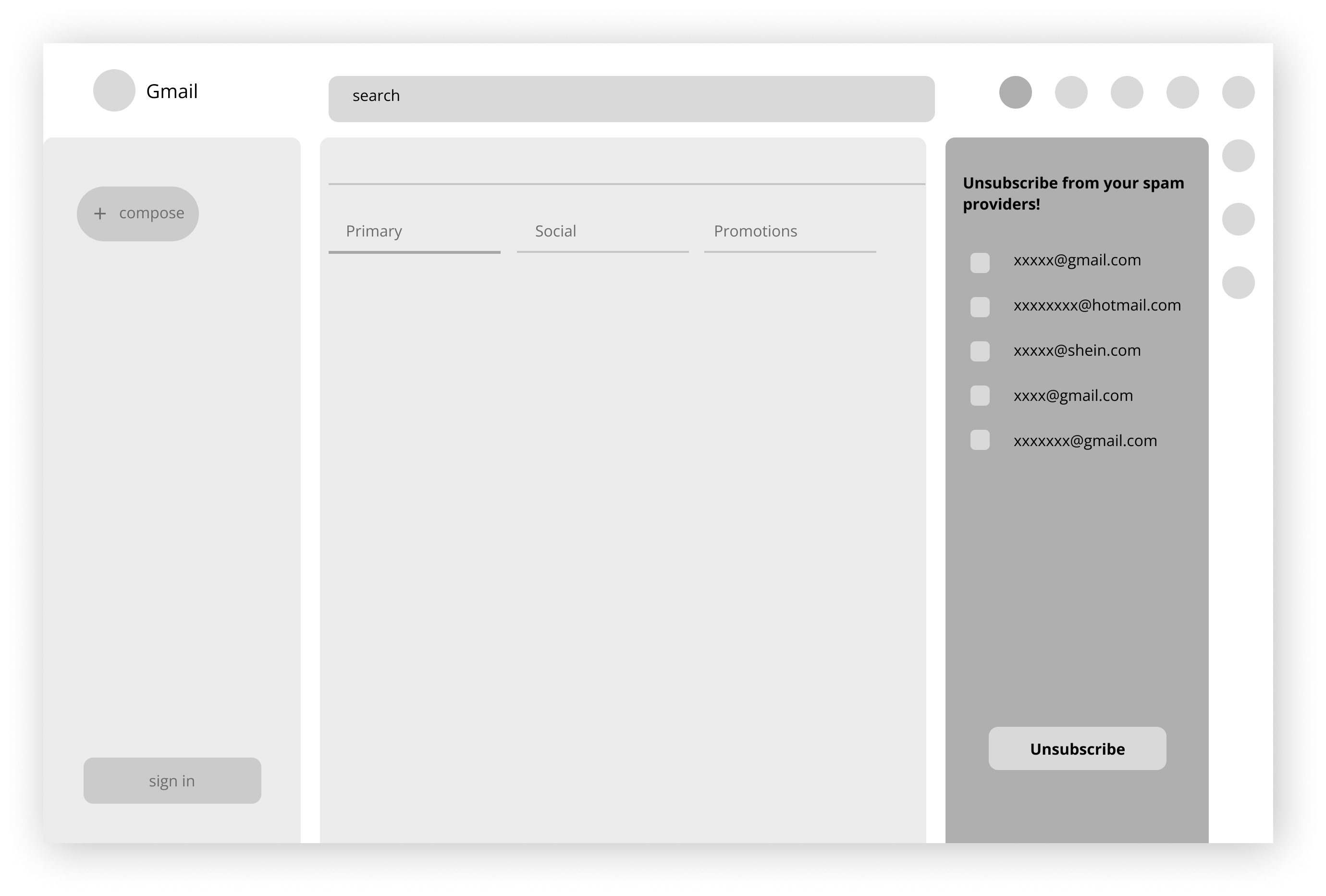
Remove spam emails permanently!
The unsubscribe feature allows users to identify and unsubscribe from multiple spam providers at once.
We presented our final prototype to 27 users and gained a 97% first-time task success rate on the new features we implemented.
What to improve
Given additional time, I would conduct more rounds of user testing and A/B testing to assess the effectiveness of the new features and monitor user retention rates. Additionally, I would take into consideration the workload of developers and examine ways to streamline certain design choices.
One of the most significant takeaways from this project was my newfound understanding of the world of UX research and design. As I worked on this project, I became more familiar with the different methodologies and techniques used in this field. I also gained a better appreciation for the importance of considering user needs and preferences when designing products and services. Overall, this project provided me with a glimpse into the vast and exciting world of UX research and design.